Slideshow presentations: the quintessential way of presenting information in the workplace. People use them a lot because we understand pictures faster than words. Visual aids help us learn and remember better.. But too often, bad design decisions can backfire and have the opposite effect. Take a look at this slide:
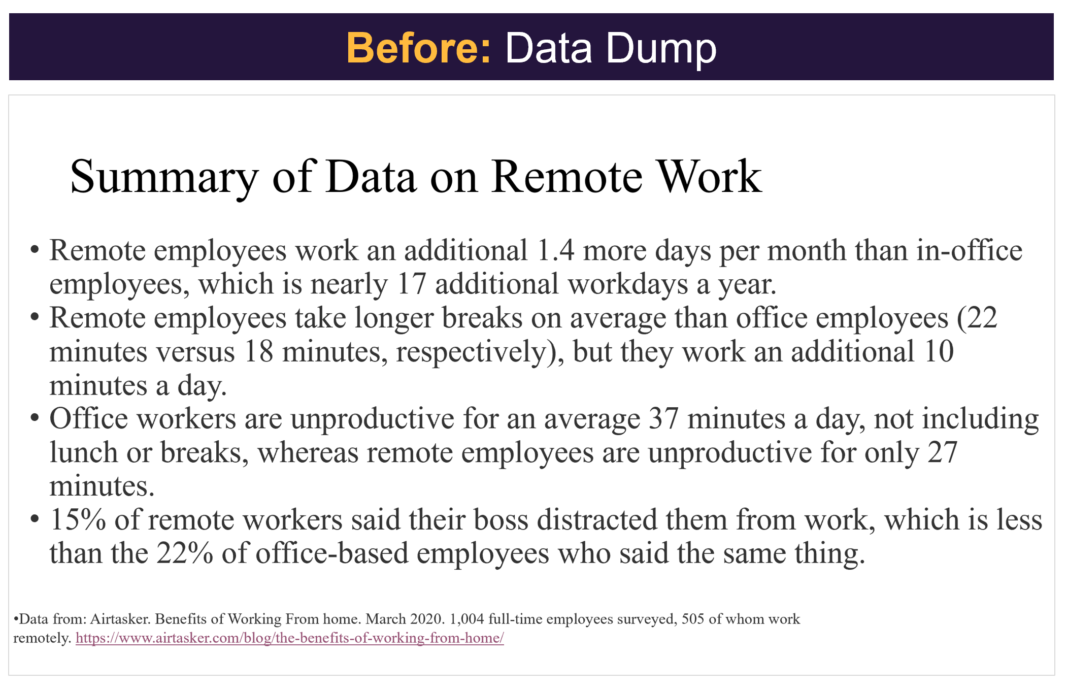
Be honest—where did you stop reading the text? We guess even the bravest readers gave up halfway through the second bullet point (or fell asleep). That’s too bad because this slide has important information about a topic many people like: remote work!
Let’s give this another go, but this time keeping in mind some basic design principles.

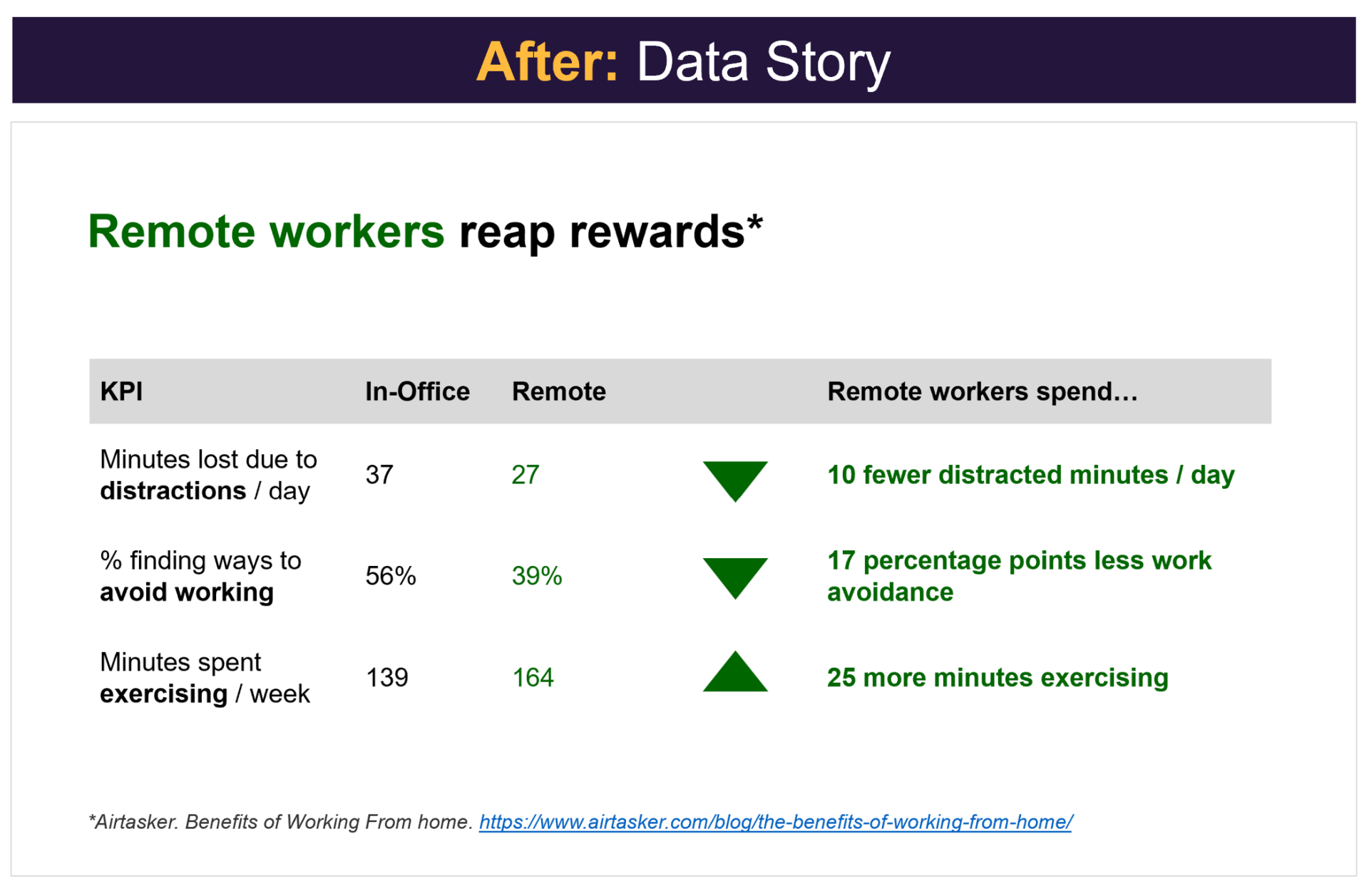
Pretty dramatic, right? Let’s explain what exactly we did to improve this slide.
Every Word Counts
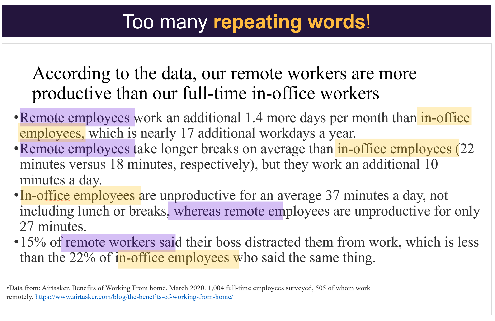
Isn’t it interesting that the second slide has about a quarter of the text of the first slide but communicates much more? Notice how the title and content are different. In the first version, the title gives an overview of the data but doesn’t highlight the main point, leaving the audience to dig through the text to find it. In the second version, the title clearly states the key point, making the rest of the information easy to follow.
Also, look at the words used. In the first version, ‘in-office workers’ and ‘remote workers’ are each repeated four times, taking up too much space on the slide. The repeated words suggest we have plenty of information in two categories, so a table might use space more efficiently.
Text Hierarchy
Notice how the title has the biggest font size? That’s intentional. Our natural inclination is to look at the biggest text first, regardless of where it’s positioned on the screen. Don’t believe us? How many of you read the text in the following order?

See how easy that was to follow? Using text hierarchy in our slides shows the audience where to look first and where to find supporting details to reinforce the message.
White Space
It’s easy to ignore small details like lining up text to the same margins. But keeping text and images in the same place on each slide makes them look neat and clear.
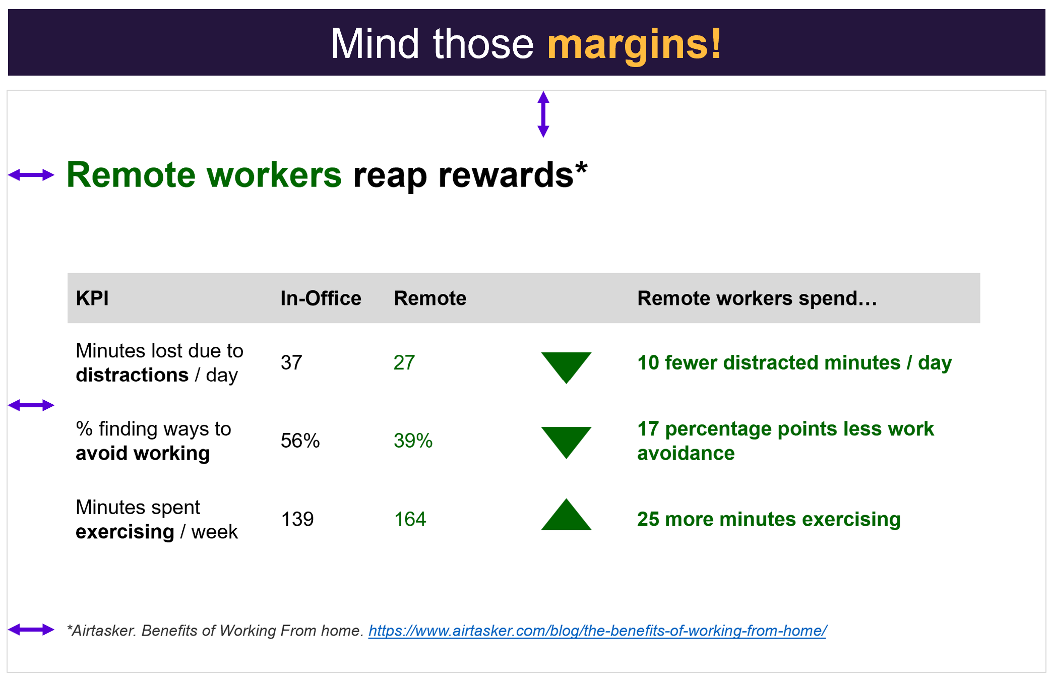
If we recognize the power of white space, clunky extras like borders or shading become redundant. Let the white space naturally separate your ideas.
Fonts
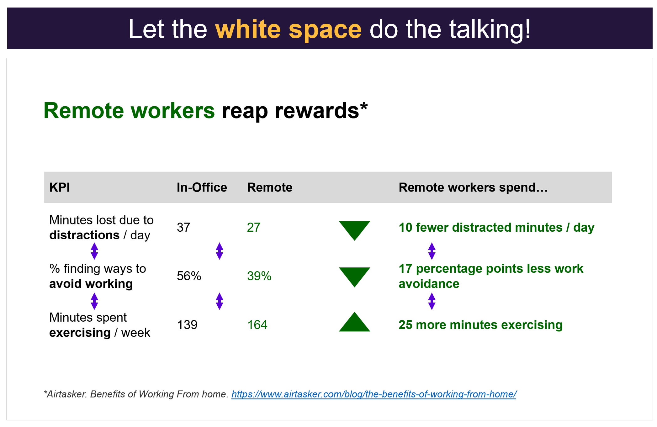
Serif fonts, like Times New Roman or Georgia, contain stylistic lines or flourishes at the end of each letter. While they may look fancy, they can be hard to read, especially when there’s a lot of text on the screen or when the text is in a table. A sans serif font, like Arial or Calibri (or the text you’re reading right now!), helps reduce visual clutter.

Using font styles like bold, underline, and italics thoughtfully can help the audience skim dense content. In this case, bolding key words and takeaways makes the information easier to skim and understand.
Color and images
Since colors, shapes, and images can create emotions and associations, we can use them to reinforce key points. Here, we’re assuming the audience links the color green with positive change, as seen in dashboard stoplight charts. Similarly, small triangles subtly show the direction of the data without needing extra text.

Be sure your color choices are accessible by using inclusive colors and good contrast between text and background. According to Web Content Accessibility Guidelines, the contrast ratio should be at least 3:1 for large text (18 points or more) and 4.5:1 for smaller text. Coolors.co is a great tool for testing accessibility.
So, there you have it! Some simple design principles that can level up your slideshow presentations.

To learn more about data storytelling and other learning opportunities related to data communication, check out our scheduled workshops or contact us to set up a special class.
Learn with us and earn your certificate. See you at our next workshop!


