
A stacked bar chart is a popular data visualization that compares categories that stack up to a larger total. Since each category builds on top of the one below it, the changing starting points make it hard to see each category’s trend over time. Yet, time after time, we see a stacked bar chart used exactly for this reason. Let’s take a look at a real-world example we saw recently of renewable energy sources in the United States:
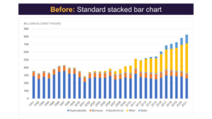
At first glance, there is nothing particularly wrong with this chart. It looks like something you might see in a report or presentation every day. However, notice how hard it is to see the main point—that wind energy has now surpassed hydroelectric power as the top renewable energy source.
Which Energy Source is bigger?
Look at the bars between 2017 and 2019 for hydroelectric and wind. Would you be able to confidently say which source produced more energy each year? Chances are, you could be right up against your screen and still not sure which one is bigger.
The biggest problem with stacked charts is that it’s hard to compare two bars if they don’t start from the same baseline.
Clustered Bar Char
Let’s try this again by unstacking the bars and creating a clustered bar chart. By comparing each Hydroelectric bar, you can immediately see which one is larger each year.
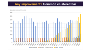
While this lets us compare each category by year more directly, it’s much messier and hard to read because of all the ink on the page!
So, what kind of chart should we choose? We still want to represent each region, we need a common baseline, and we want to show a series over time.
Line Chart
We need a line chart:
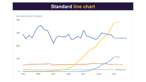
Look at this instant improvement. Not only are the categories still easy to compare, but you are also able to follow the trend more clearly.
Taking it to the next level
But this is not the end for our line chart, as there are still some design considerations we can apply to make the takeaway even clearer. Let’s use a few tricks:
- Push our other categories to gray
- Add a bold color to our chosen highlighted line to make it stand out
- Add a title to capture the audience’s attention
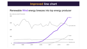
This is an instant improvement from the initial stacked bar chart. We now have a chart that shows a clear trend, starts each category on an even base, and uses far less ink on the page for a cleaner and more readable chart.
To learn more about data storytelling and other learning opportunities related to data communication, check out our scheduled workshops or contact us to set up a special class.
Learn with us and earn your certificate. See you at our next workshop!