

Creating impactful line charts takes more than just plotting data points. A bit of creativity and insight can turn you from a good data storyteller into a great one. Let’s explore three ways to bring new life to your graphs using our ‘ESCape’ method: Eliminate, Separate, and Calculate.
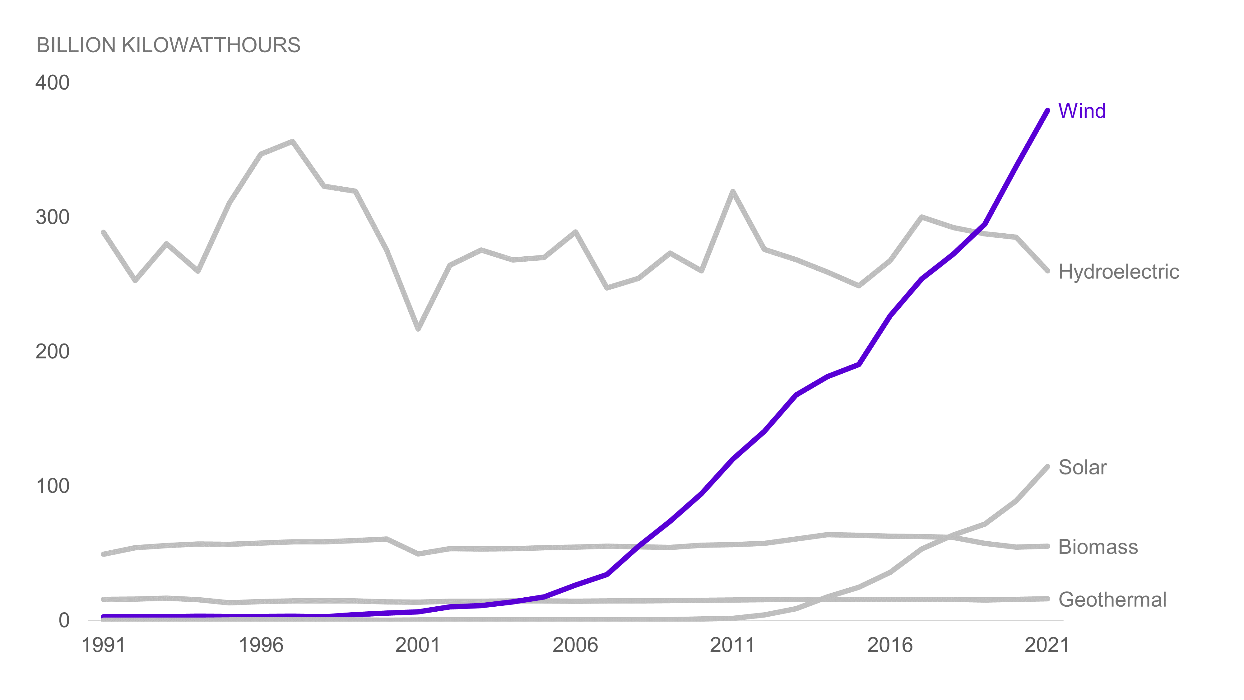
We’ll be utilizing our chart from the final makeover in the “When not to use a stacked bar chart” blog as our subject for this exercise:
Eliminate
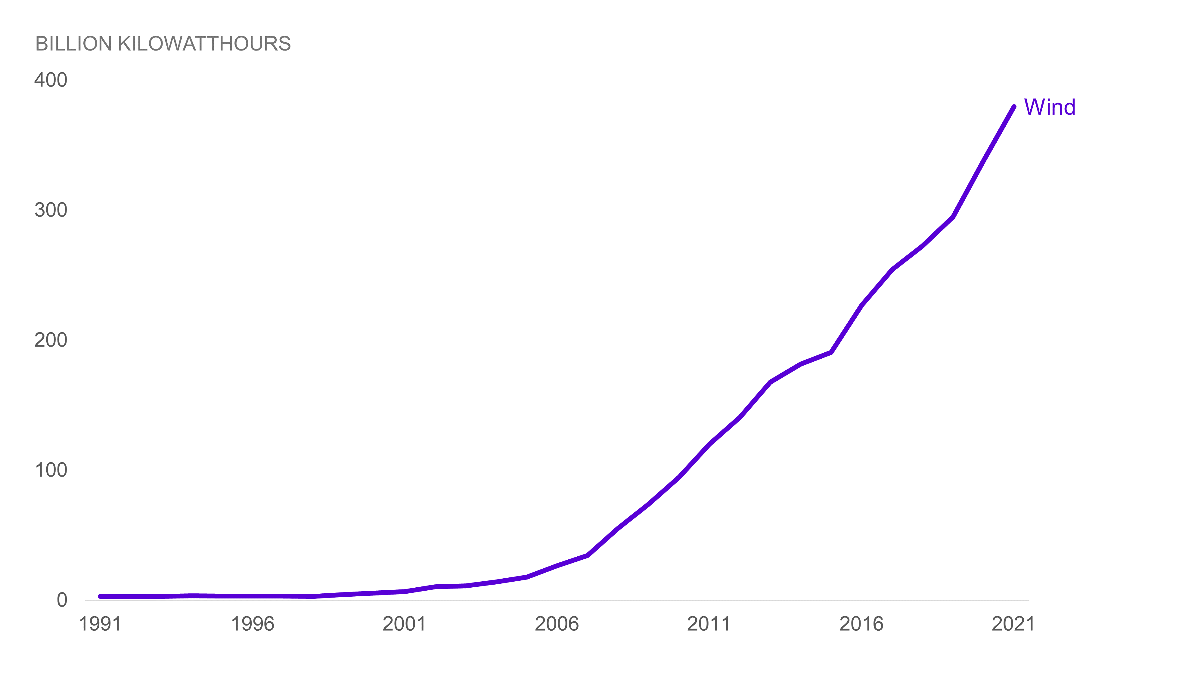
Sometimes, less is more. The simplest way to refine your chart is by eliminating any information not relevant to your audience. It may feel uncomfortable at first — we’re often conditioned to believe that an abundance of information is always desirable. However, bear in mind that your data isn’t lost forever. You can retain the deleted detail in an appendix, ready to be referenced as needed.
For example, if we’re focusing only on the impact of wind on energy production, we could create a chart with all unrelated data removed:
Separate
If we want to show each renewable energy source separately, we could create a slide for each one, like we did for wind. But what if we want to compare the trends across all five energy sources at once?
One effective way to do this is by breaking the chart into smaller sections and placing them side by side. This approach, known as a ‘small multiple’ chart, allows us to see the overall trends more easily. Here’s our chart, broken down into small multiples for easier comparison:
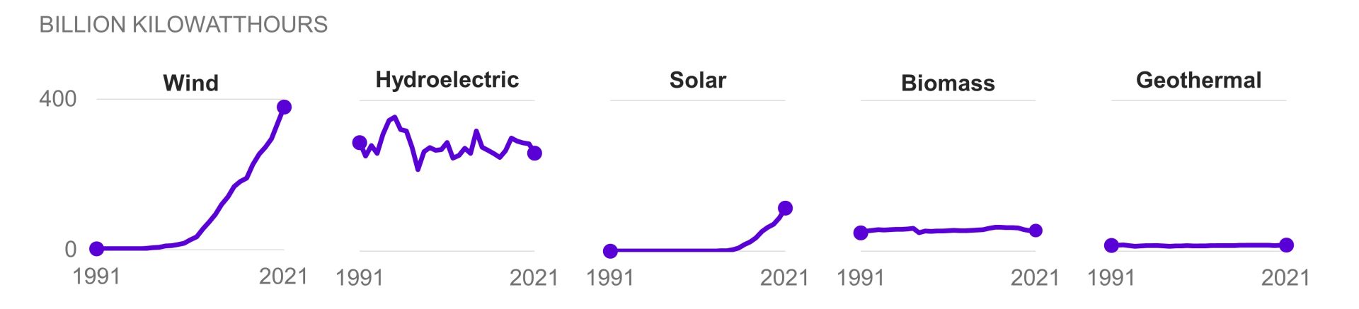
Our small multiple provides our audience with a lot of information, but it does so in an organized way that makes it easier to understand. Often called a panel chart, a small multiple is like a table of charts. It takes several charts, shrinks them, and arranges them neatly side by side. This technique works well for almost any chart type, especially bar charts, line charts, dot plots, and scatterplots.
When faced with an overwhelming chart, ask yourself if you can break it into smaller pieces, each highlighting a unique part of your data.
Calculate
Sometimes, the data we have isn’t exactly what our audience needs to see. In our initial chart, we display each energy source as a separate series. But what if our goal is to show the total energy produced by renewable sources in billion kilowatthours since 1991? A simple calculation can reduce the number of series and help present the data that truly matters:
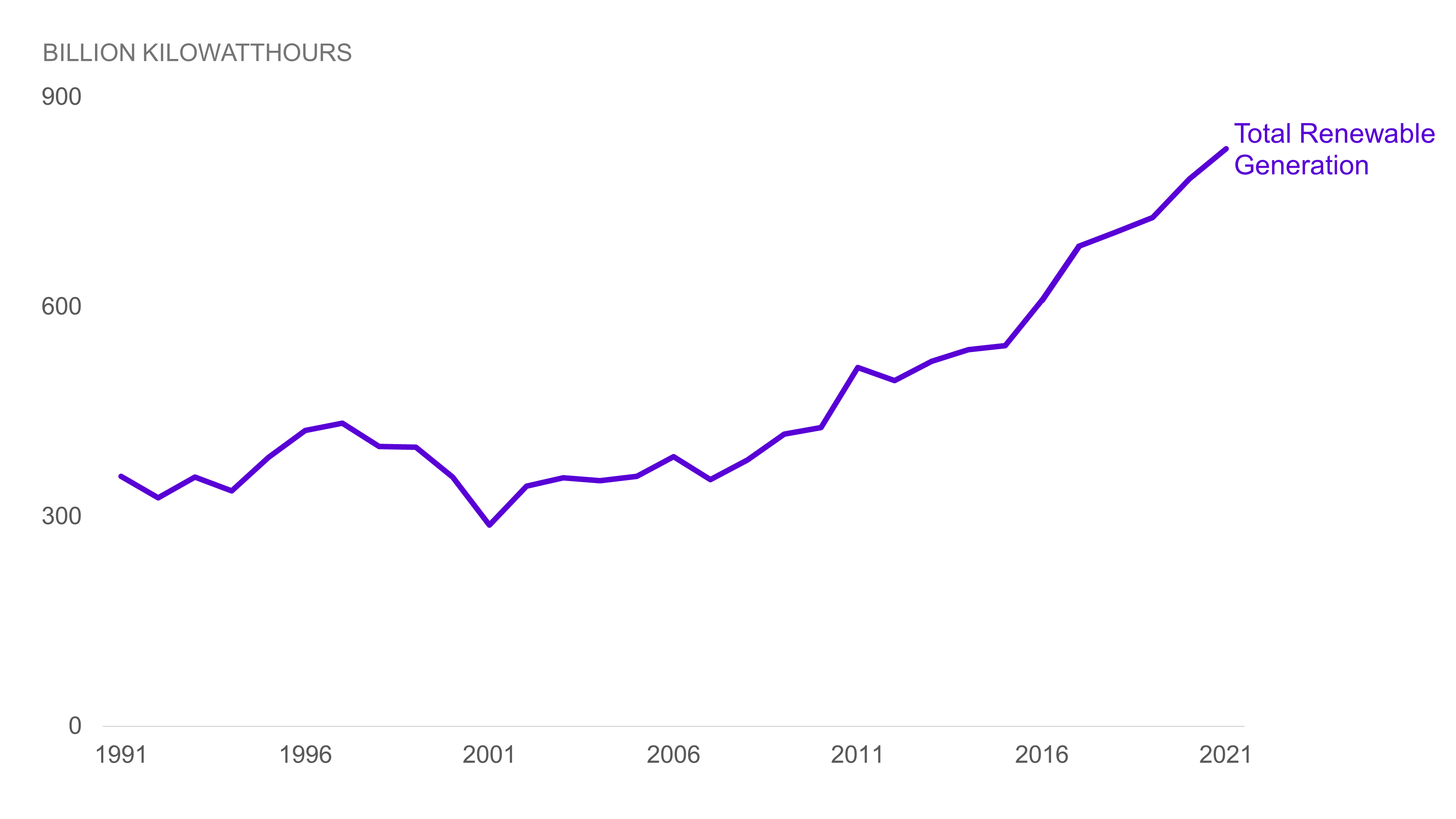
This chart removes unnecessary details, highlighting the significant increase in renewable energy production since 1991. It’s a great example of how the right calculation can reveal the true value of your data.
As you continue your data storytelling journey, remember the power of the ESCape method. It can help you create more effective visuals and give your audience clear, actionable insights.
To learn more about data storytelling and other learning opportunities related to data communication, check out our scheduled workshops or contact us to set up a special class.
Learn with us and earn your certificate. See you at our next workshop!