

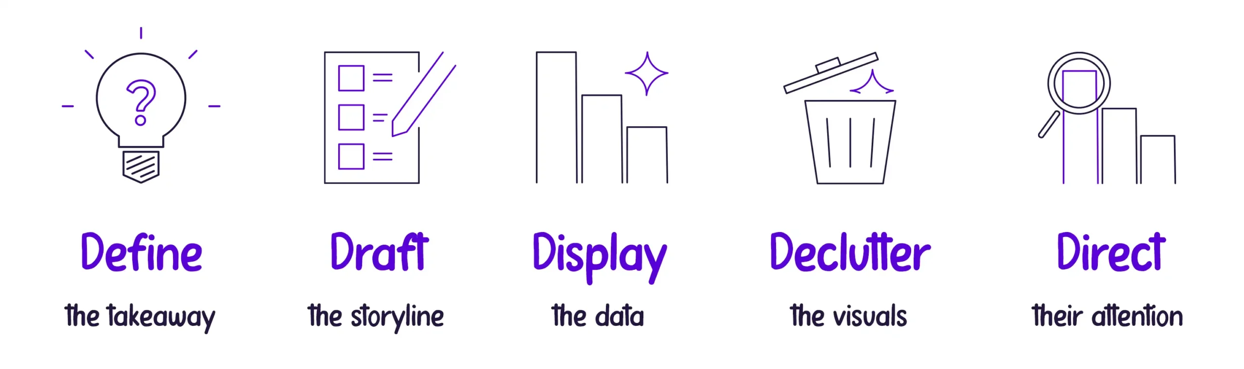
We’ve talked a lot about why Data Storytelling is important. However, it can be tricky to figure out how to begin applying it to your work. To make the process easier to comprehend and remember, here are five simple steps we’ve created called the 5Ds of Data Storytelling:
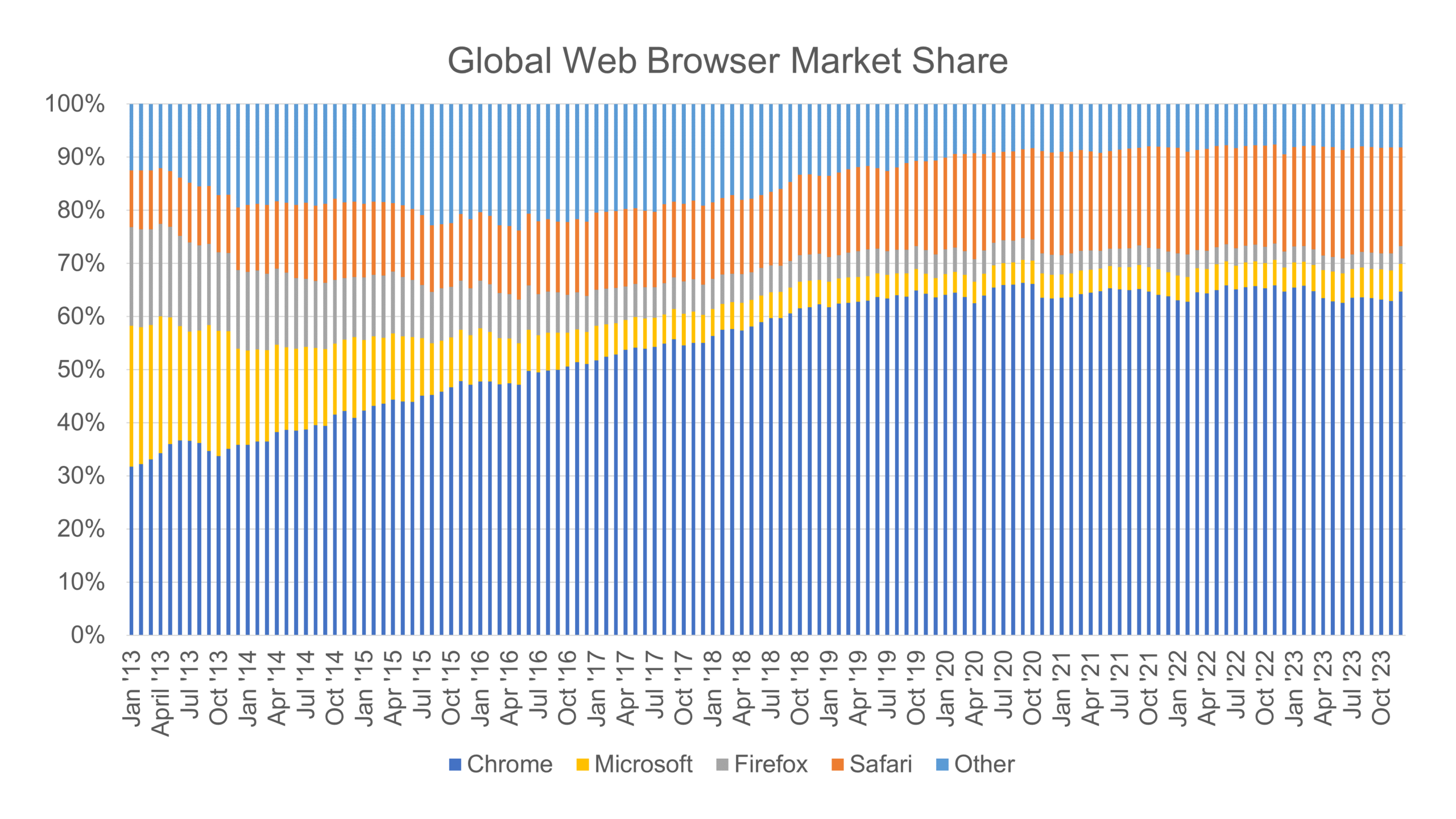
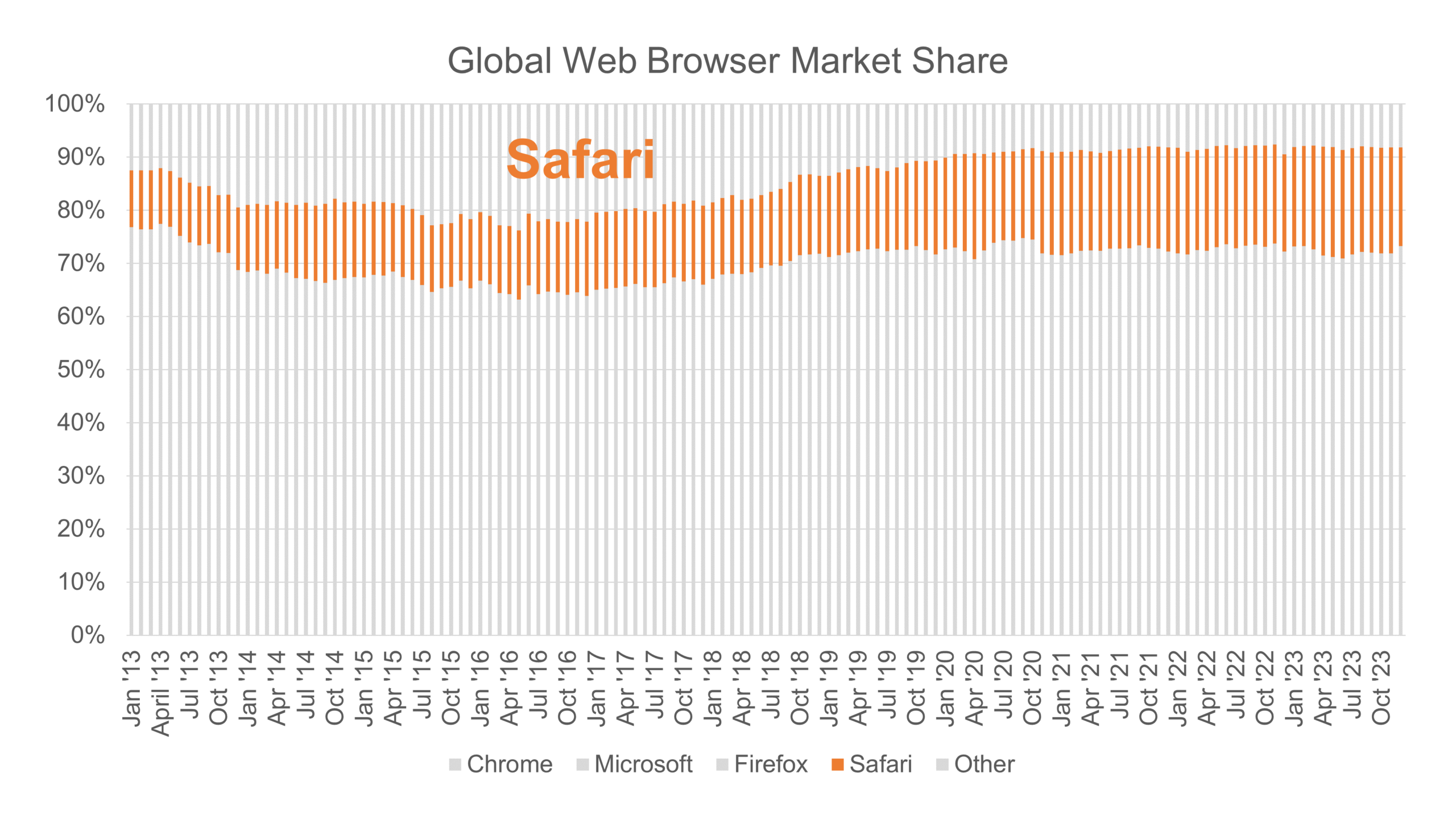
Let’s walk through how we applied the “5Ds” process step by step to transform the data analysis of this default chart on the Global Web Browser Market Share:
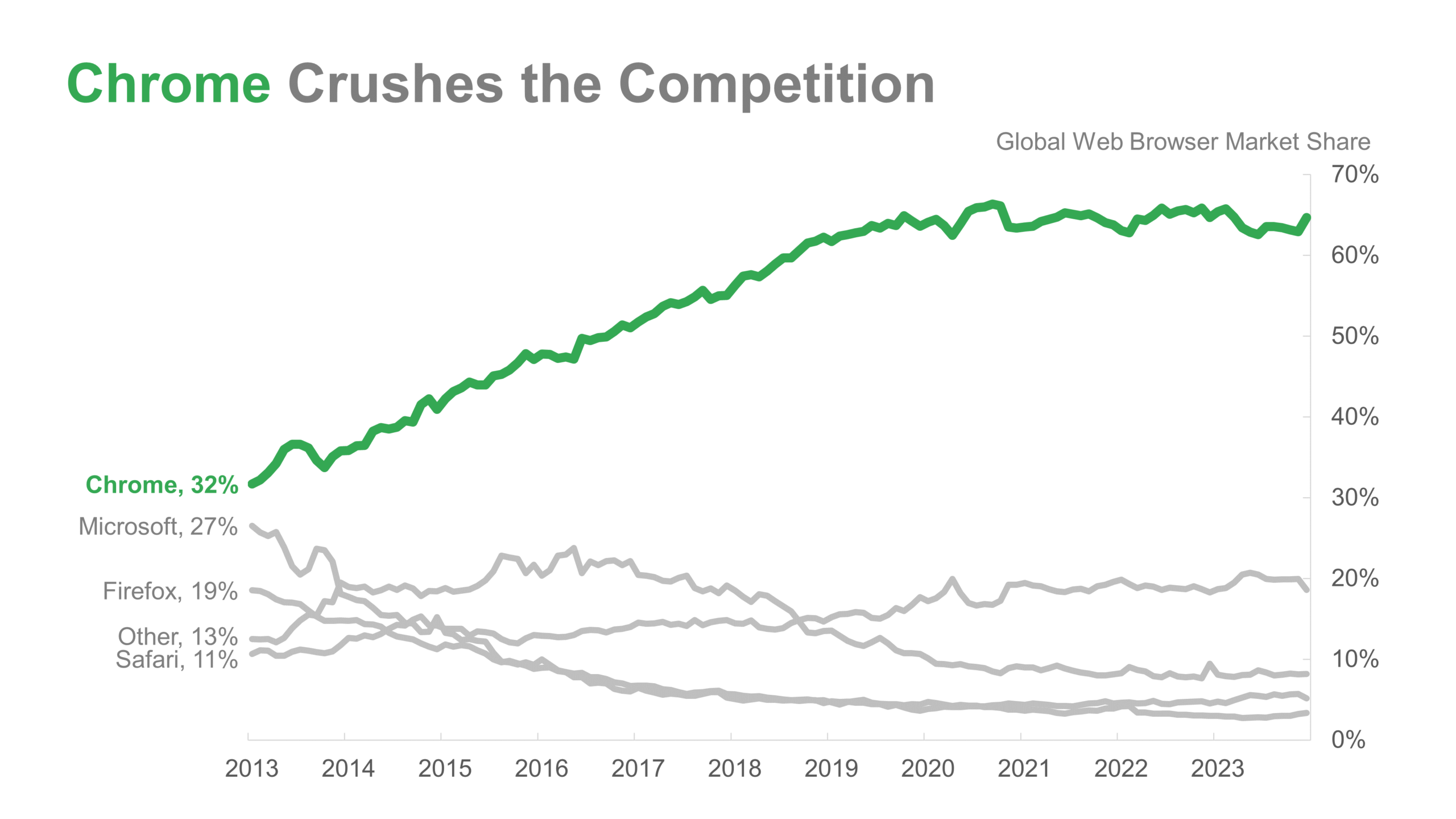
…to this made-over version with a clarified message:
1. Define
Our first step is to know our audience so we can define the most critical insights from our dataset that would be valuable to them. We must know our data inside out. But we also need to consider our stakeholders from the start. Their needs and expectations should guide us in defining what message to highlight. What does our audience care about? How can we link our message closely to what matters to them?
In our sample chart or graph, there are many noteworthy trends that we could choose to focus on. The trend that stands out most is the rapid rise in Google Chrome’s market share, which has more than doubled in the last eight years. This well-known product’s explosive growth might be the most relevant story for a broad audience.
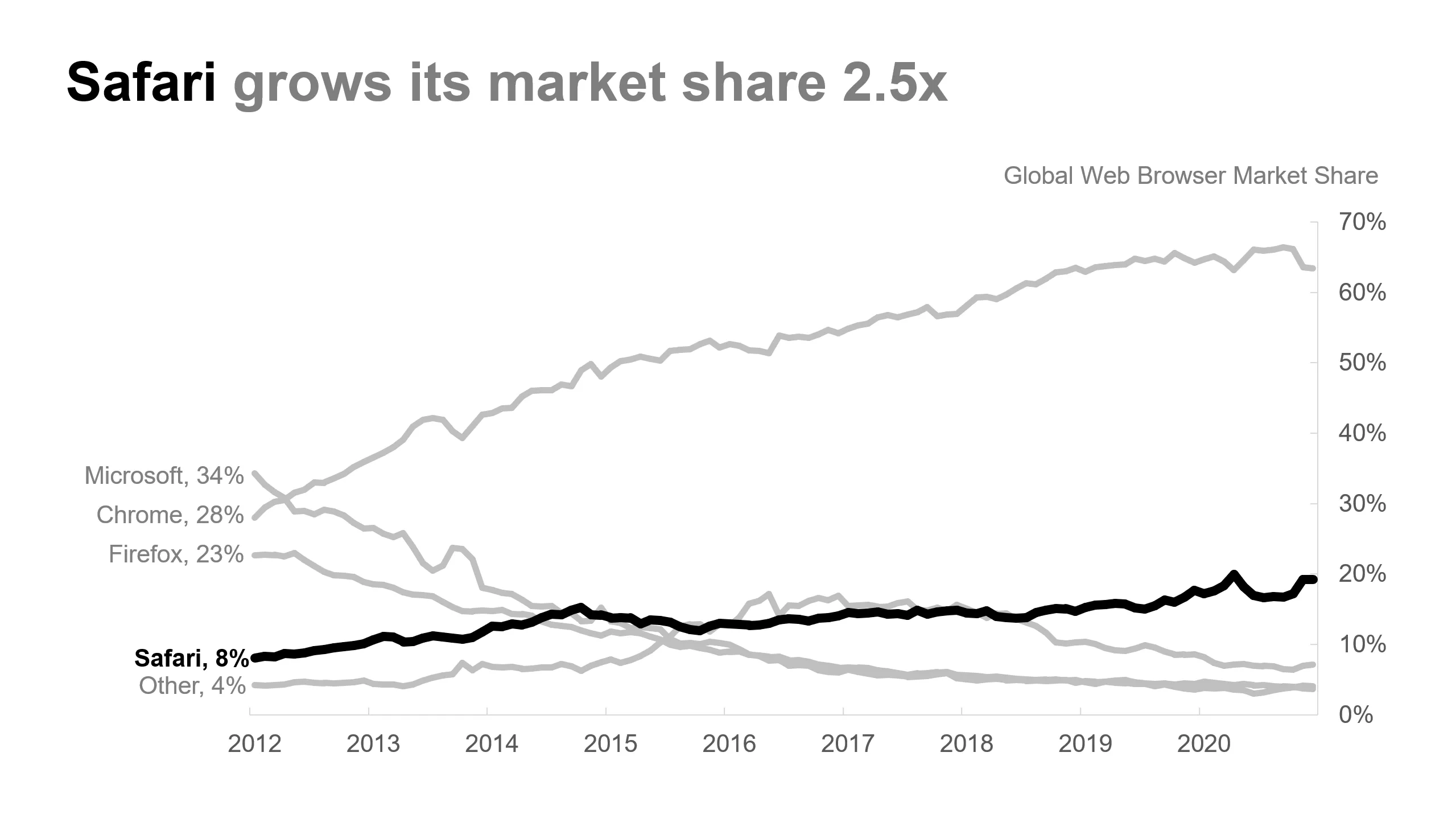
However, imagine that we are presenting to an audience of iOS (iPhone) developers. These developers may be more interested in Apple’s Safari browser’s market share, especially on mobile devices.
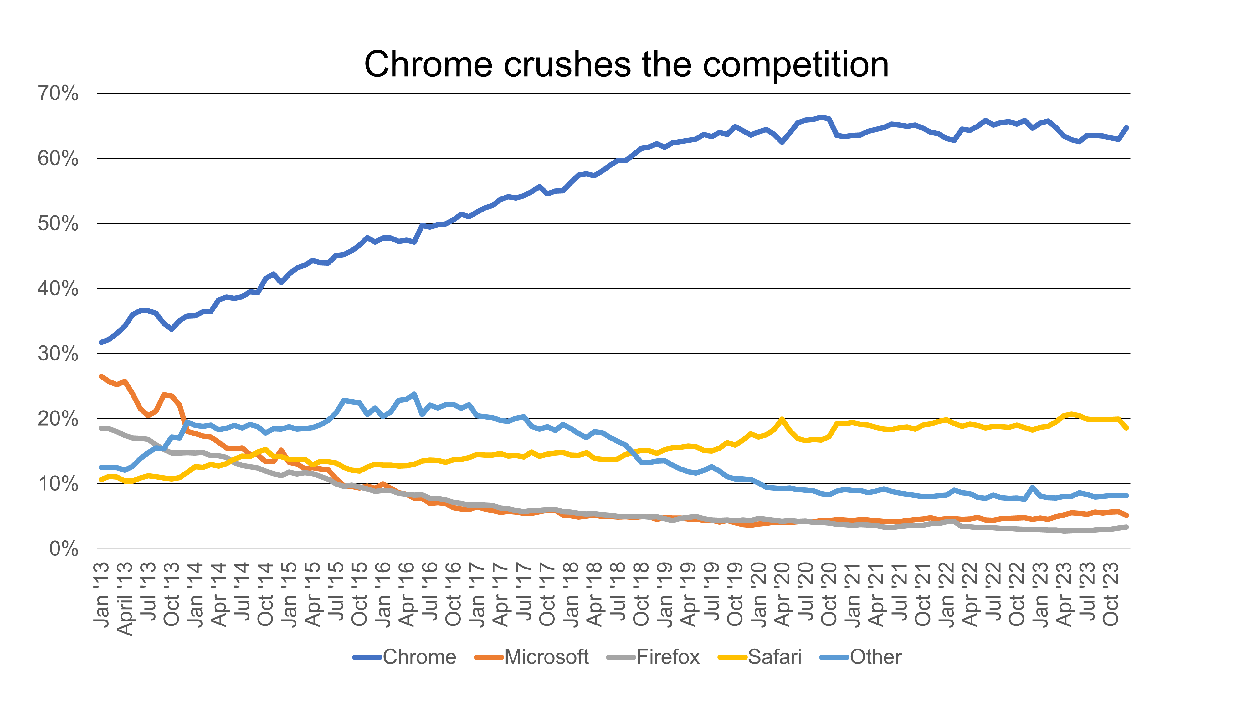
As data storytellers, we must find the insights that best serve our audience. Then, we must present the chart or graph to highlight the essentials. Once we’ve established what our audience needs to know, we want to convey our insights concisely. Our new headline, “Chrome Crushes the Competition,” helps us achieve this, capturing the key insight using just four words.

2. Draft
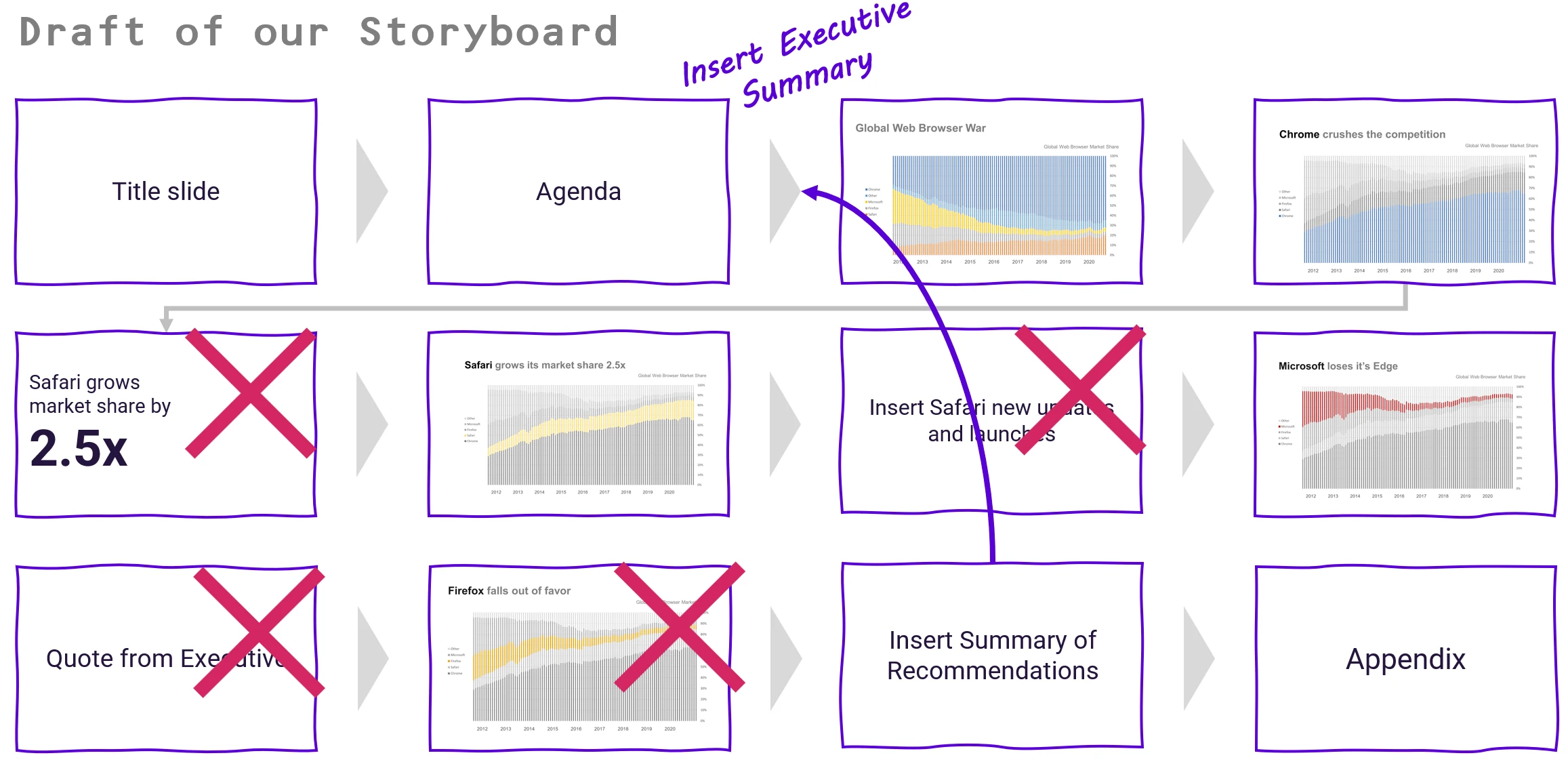
In this example, we are focused on forming a single slide highlighting a key message relevant to our audience. But in a typical business context, we might be asked to present a full deck comprising multiple charts and other slides that may or may not contain data. The last thing our audience needs is a long list of insights that might not be necessary or make sense altogether. Not only can this be overwhelming, but it can also be a waste of everyone’s time to go through data points that are not valuable for that moment.
Drafting our story helps us see the big picture. This avoids wasting time on unneeded slides in our data story. It can be easy to get lost in the sea of insights and end up with dozens of slides or data visualizations, half of which we might not even use. By keeping our story’s pillars in mind, we can decide what to show stakeholders, what to put in the appendix, and how to sequence them to drive our point.
Use Slide Sorter view to see your slides’ relationships. It helps you to sequence them for your audience and remove any non-essential parts. This will improve your data story.
3. Display
Back to our main chart: We now have a critical choice. How do we visualize our data so that it’s easy for our audience to understand? Do we need to use a chart, and if so, what chart type will best showcase our insights? This is where thoughtful chart selection comes into play. Every chart has a specific purpose, and not all charts can be easily perceived by the human eye. We must consider not what looks good, but what works best. The “Display” step forces us to find the best chart to communicate our insights to the audience.
In this case, our top choice for visualizing trends over time is a line chart. Compared with our 100% stacked bar chart, we can see that the lines facilitate a faster comparison of each product’s market share.
4. Declutter
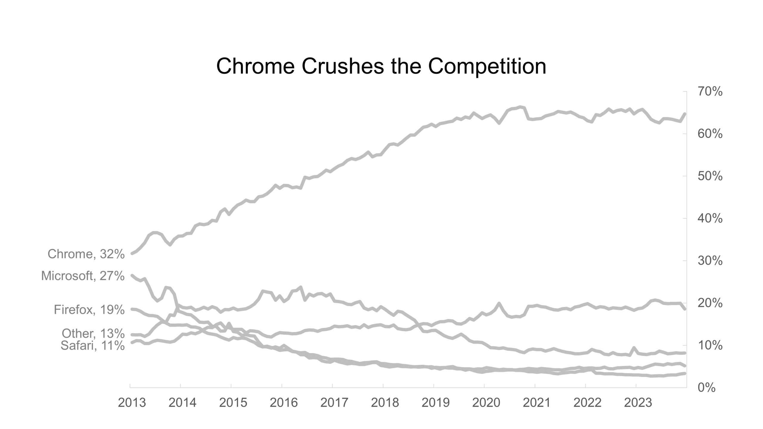
After choosing the best chart type, we must remove any visual components that don’t support our key takeaway. Often, these extra chart elements could distract from the main message we want to highlight and cloud the minds of our audience.
In this example, we can simplify the chart by:
- Removing gridlines.
- Simplifying the X-Axis labels.
- Replacing the legend at the bottom of the chart with labels next to each series, allowing us to use color more sparingly.
5. Direct
Finally, we want to direct our audience to the parts of our chart that support our key insights. In this case, we’re highlighting the Google Chrome series in bright green. This highlighting lets our audience immediately identify that the data supports our title and key takeaway.
Guiding our stakeholders to the right information helps them make better, data-driven decisions.
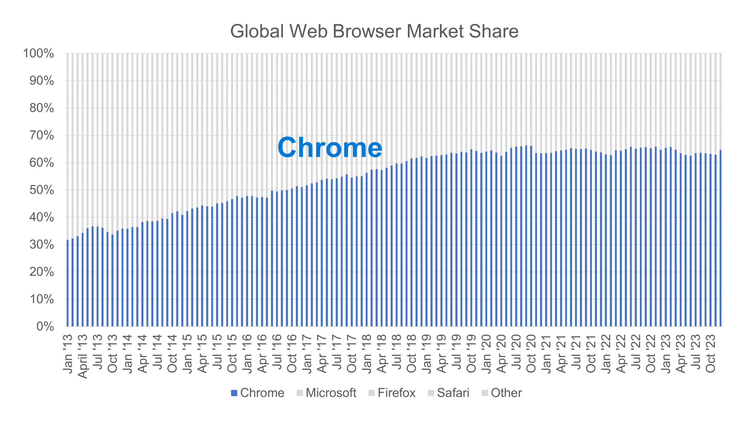
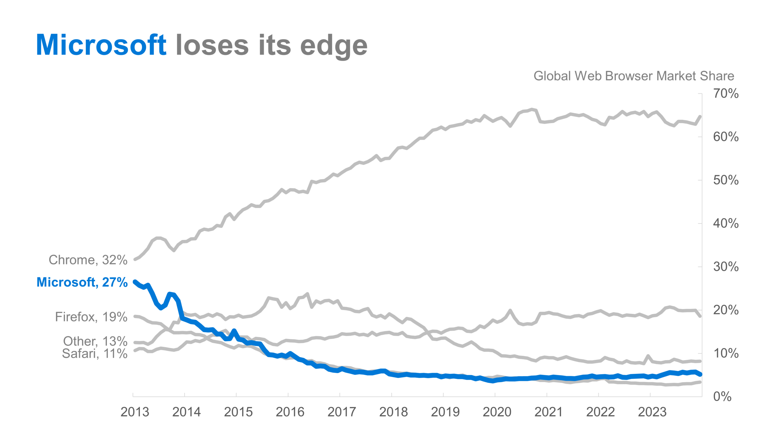
A well-designed, clutter-free chart is a powerful tool for directing our audience’s attention to additional insights. This could also help stakeholders make better data-driven decisions. For example:
Or:
Whatever message we highlight, the 5Ds of Data Storytelling help. They ensure our audience understands and engages with it. This helps them make data-driven decisions.
Want to dive deeper into the 5Ds and apply this in a more comprehensive example? Check out our book, Data, Story, Action!.
To master the art of Data Storytelling and find other learning opportunities on data communication, check our scheduled workshops or contact us to set up an exclusive training.
Learn with us and earn your certificate in Data Storytelling. See you at our next workshop!