
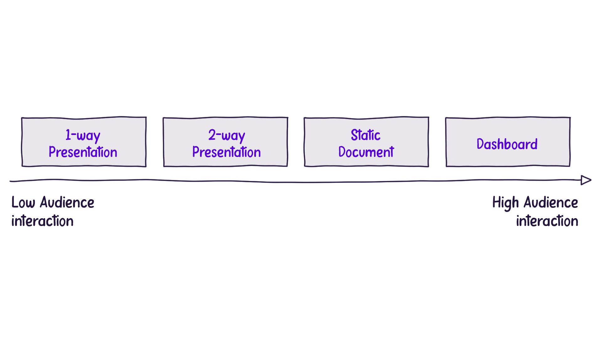
In data storytelling, it’s important to keep the audience at the center of every design choice. One key factor is the presentation format, which we determine by asking, “How will our audience interact with our story?” Usually, the answer fits into one of four main categories.
Understanding the Four Presentation Medium Formats
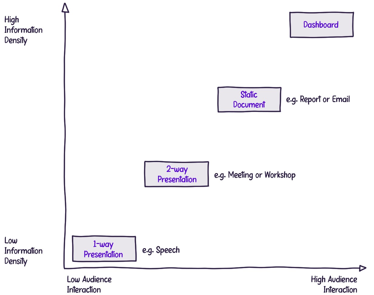
One-Way Presentation: In this format, the presenter speaks, and the audience listens without interruption. Communication flows from the presenter to the audience, with no expectation for questions or comments. TED talks and keynote speeches are prime examples of one-way presentations.
Two-Way Presentation: In this format, the presenter leads the discussion but allows the audience to ask questions or make comments. Most business presentations are like this.
Static Document: The audience consumes a document independently, without a live presentation to guide them. As a result, all necessary information must be included in the document itself. An example of this would be a company’s annual report.
Interactive Document: This type of presentation allows the audience to engage with the content in real-time, producing tailored views of the data. Interactive dashboards are a common example.
Evaluating Audience Control over Information Flow
To better understand the different formats, we can examine the levels of audience interaction, ranging from minimal control to maximum control over the information flow:
In a one-way presentation, such as a keynote speech, the audience has no control over the content they see and hear. The presenter dictates the information flow, and the audience’s only option for exercising control is to leave the venue.
Balancing Information Density
When giving a one-way presentation, presenters must be careful not to overload the audience with information. If a complex chart is shown without a clear explanation, the audience may struggle to understand it, and they won’t have a chance to ask questions.
In contrast, interactive dashboards give the audience full control, letting them explore and work with the data at their own pace. These presentations can show more information since the audience doesn’t need a speaker to explain it.
This leads to the concept of ‘information density,’ which is the amount of information in each slide, page, or screen. When the audience has less control over the flow of information, we should keep things simpler to avoid overwhelming them. But as the audience gains more control and can take in content at their own speed, they can handle more information.
Conclusion
Knowing the four presentation formats and considering audience control and information density makes data storytelling more effective. The key is to tailor your approach to the audience’s needs, so they can easily understand the information
To learn more about data storytelling and other learning opportunities related to data communication, check out our scheduled workshops or contact us to set up a special class.
Learn with us and earn your certificate. See you at our next workshop!