In data storytelling, it’s crucial to keep the audience at the heart of every design decision. One essential aspect to consider is the format of the presentation, which can be determined by asking, “How will our audience interact with our story?” Typically, the answer falls into one of four major categories.
Understanding the Four Presentation Medium Formats
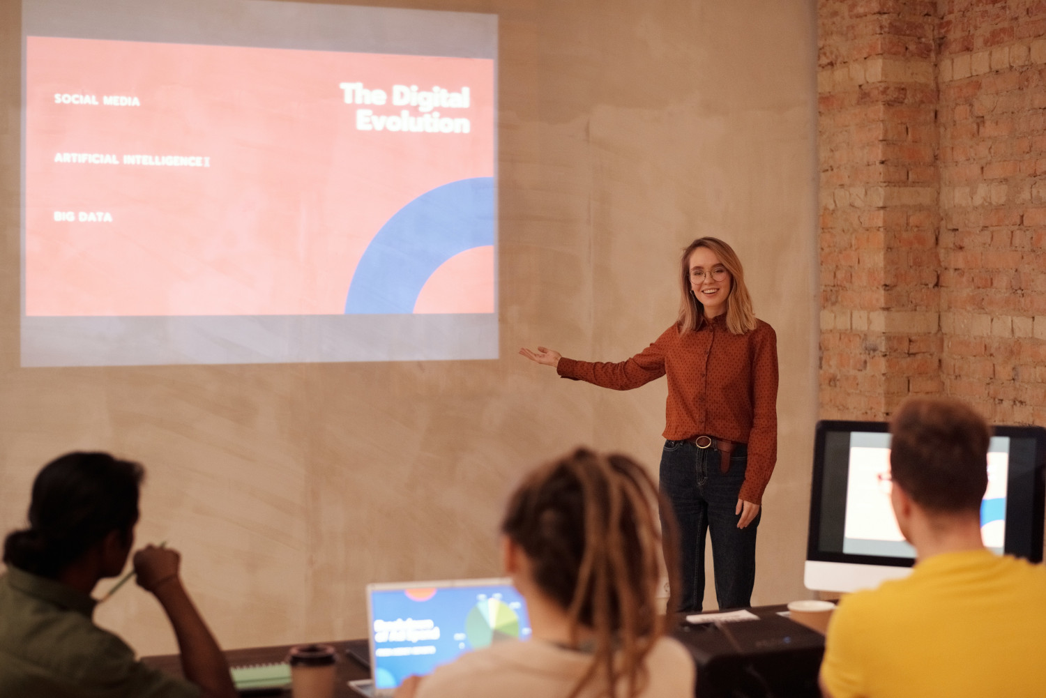
One-Way Presentation: In this format, the presenter speaks, and the audience listens without interruption. Communication flows from the presenter to the audience, with no expectation for questions or comments. TED talks and keynote speeches are prime examples of one-way presentations.
Two-Way Presentation: Here, the presenter leads the discussion while allowing the audience to contribute with questions or comments. Most business presentations fall into this category.
Static Document: The audience consumes a document independently, without a live presentation to guide them. As a result, all necessary information must be included in the document itself. An example of this would be a company’s annual report.
Interactive Document: This type of presentation allows the audience to engage with the content in real-time, producing tailored views of the data. Interactive dashboards are a common example.
Evaluating Audience Control over Information Flow
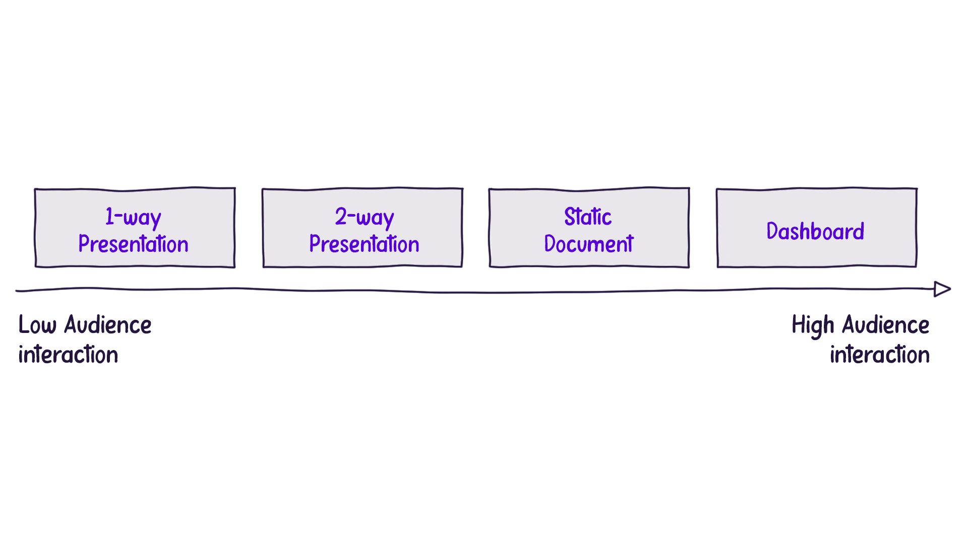
To better understand the different formats, we can examine the levels of audience interaction, ranging from minimal control to maximum control over the information flow:

In a one-way presentation, such as a keynote speech, the audience has no control over the content they see and hear. The presenter dictates the information flow, and the audience’s only option for exercising control is to leave the venue.
Balancing Information Density
When delivering a one-way presentation, presenters must be cautious not to overwhelm the audience with information. If a complex chart is presented without proper explanation, the audience may struggle to comprehend it, and they won’t have the opportunity to ask questions.
On the other hand, interactive dashboards offer the audience maximum control, as they can explore and manipulate the data at their own pace. Consequently, these presentations can contain more information, as the audience isn’t reliant on oral commentary to understand the content.
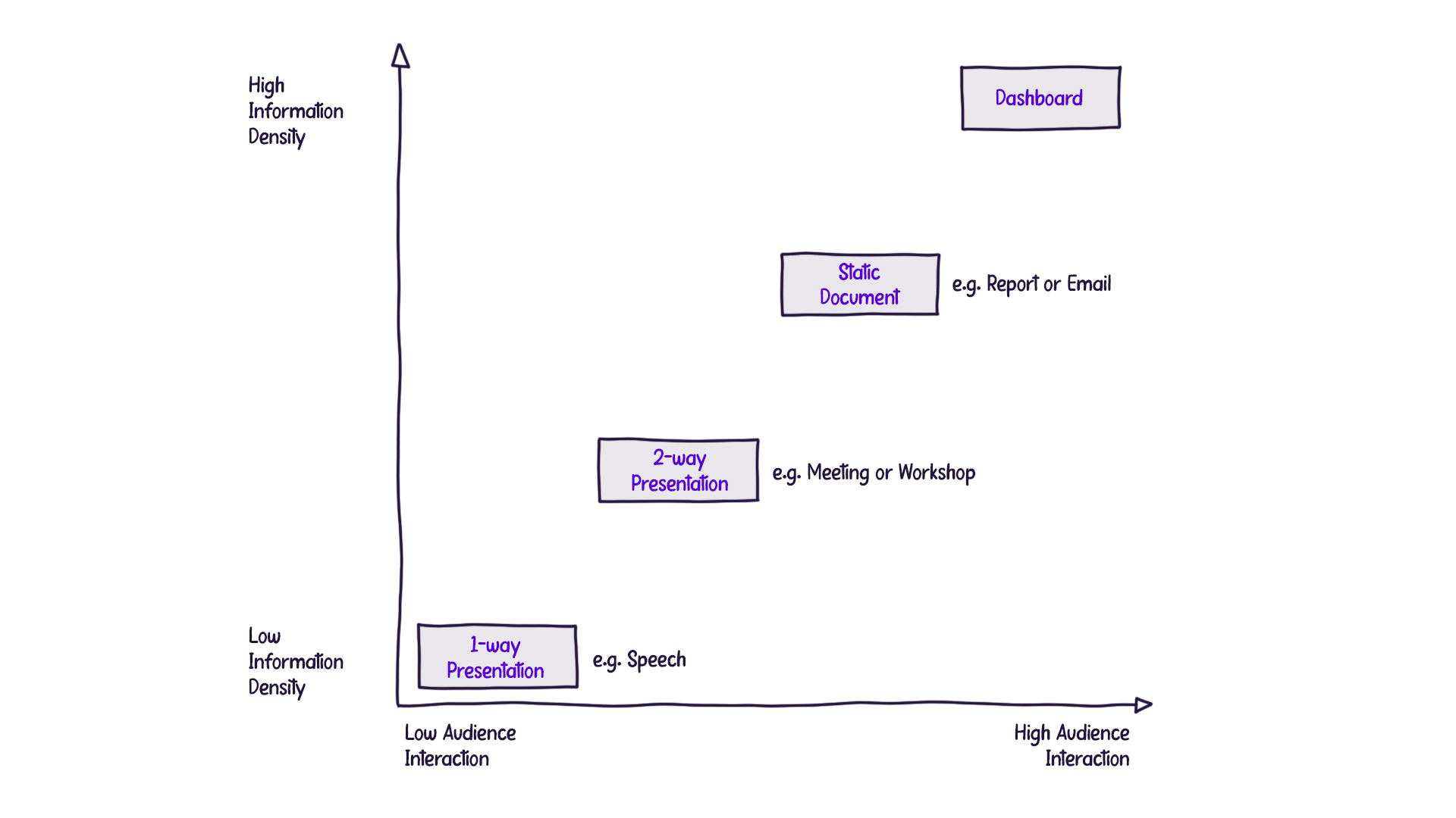
This brings us to the concept of “information density,” which refers to the amount of information packed into each slide, page, or screen. The less control the audience has over the information flow, the lower the information density should be to prevent overwhelming them. Conversely, as the audience gains more control and can consume content at their own pace, they can handle greater information density:

Conclusion
Understanding the four presentation formats and carefully considering audience control and information density creates a more effective data storytelling experience. The key is to tailor your approach based on the specific needs and expectations of your audience, ensuring that they can easily grasp the information being presented.

