All businesses live or die on the quality of their decisions. Think of any company you admire: to grow from nothing into a success, they had to make a series of tough choices. No matter your role or industry, helping businesses make better decisions is essential. And the fuel behind all decision-making is data and analytics.
Now, everyone—not just analysts and data scientists—is racing to be more data-driven. It seems the path forward for business professionals is simple: collect good data, analyze it, and then let that data guide stakeholders toward better decisions that create business value.
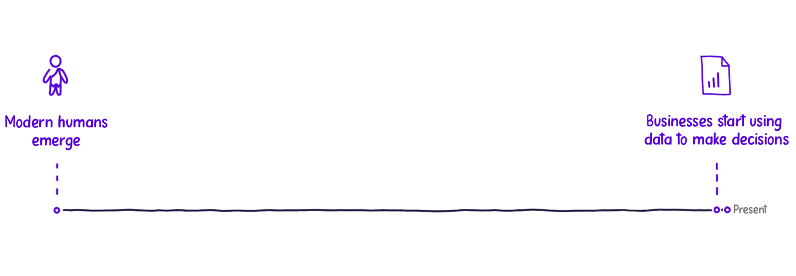
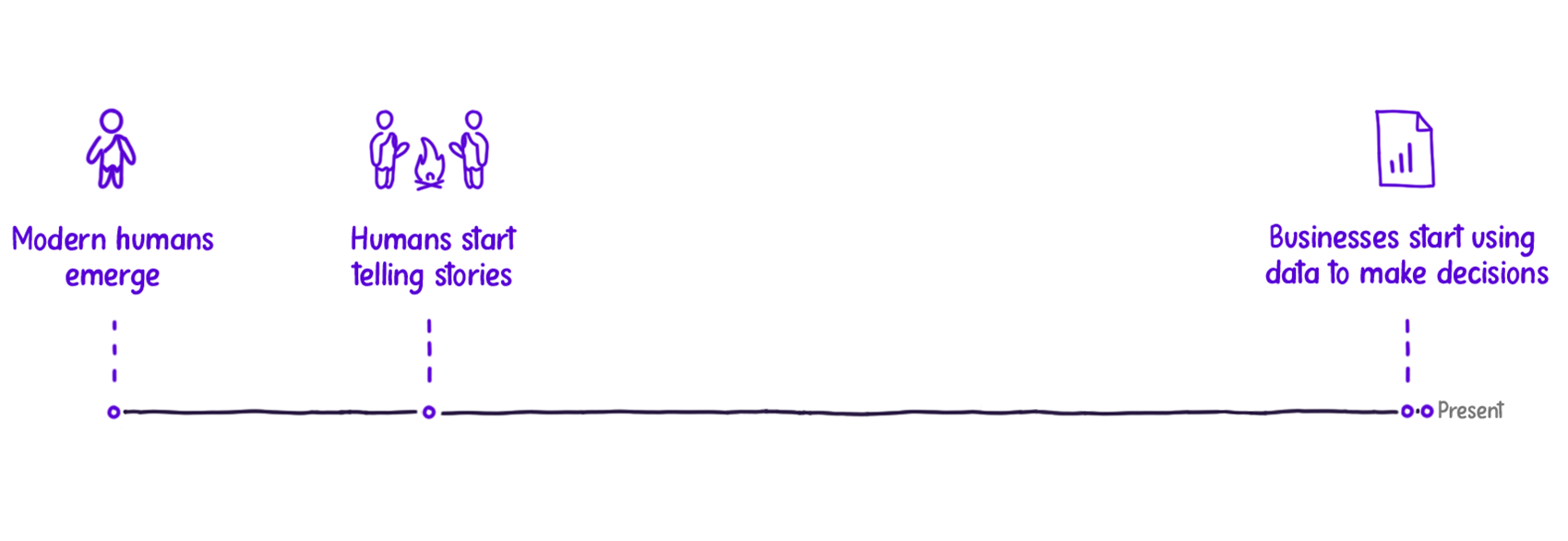
But it’s not that simple. Data, facts, and numbers alone rarely motivate or inspire us. Data needs to be presented to decision-makers, and decision-makers are human. Like all humans, they can miss important insights, feel overwhelmed by too much information, or let their own biases interfere. And who can blame them? In the scope of human history, we’ve only been using data reports and dashboards for a short time.
The good news is that humans have found a way to share information. It cuts through the noise, sticks in our minds, and inspires action. This method, used by journalists, filmmakers, and even your friends around a campfire, is storytelling.
Stories have a natural ability to grab our attention and keep us interested. Thousands of years after the first stories were painted on cave walls, we’re now learning that storytelling is more than just an old art form. It’s a key part of how we think, rooted in how our brains work.
Our overwhelming desire to see the impact of facts and events on human characters was demonstrated in a 1944 study by psychologists Fritz Heider and Marianne Simmel. They showed participants an abstract film depicting two triangles and a circle bouncing around the screen.
Here is a representation of key frames from the Heider-Simmel Illusion:
Even though the film was abstract, participants treated the shapes like people when asked what they saw. They saw intentions, conflicts, and emotions in the triangles and circles. This experiment showed that people naturally use storytelling to understand and remember information, even when it’s abstract.
One thing is clear: we are wired to connect with stories. Stories provide structure and flow, making complex information easier to understand. This is why storytelling is so powerful for communicating data—it makes data’s message stick.
Using storytelling in business isn’t just a smart choice; it taps into the brain’s natural way of processing information. By putting our insights into stories, we make our messages easier to remember and understand. We’re using a human instinct that has existed for thousands of years.
Why is data storytelling important?
More and more organizations worldwide are recognizing why data storytelling is essential for making important business decisions. Unfortunately, data literacy and communication skills haven’t kept up with the growth in data. As a result, we still see reports and presentations that confuse and alienate the people who rely on them to make decisions.
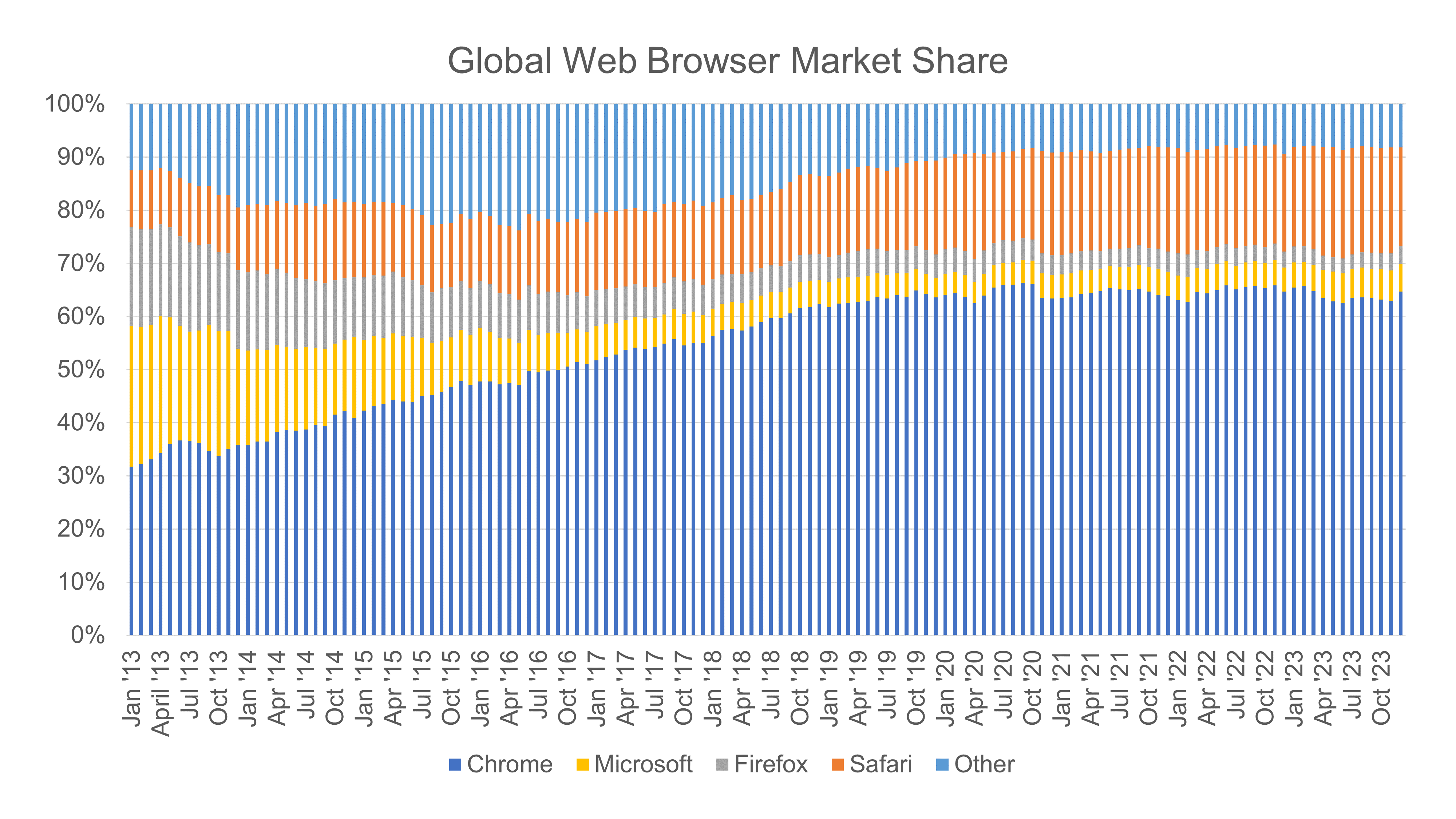
Data storytelling lets us create reports and presentations. They deliver clear, focused insights that can drive stakeholders to take action. Take the chart below, created using Microsoft Excel’s default settings. No data storytelling techniques have been applied to it. Can you identify the key insights the creator wants to share?
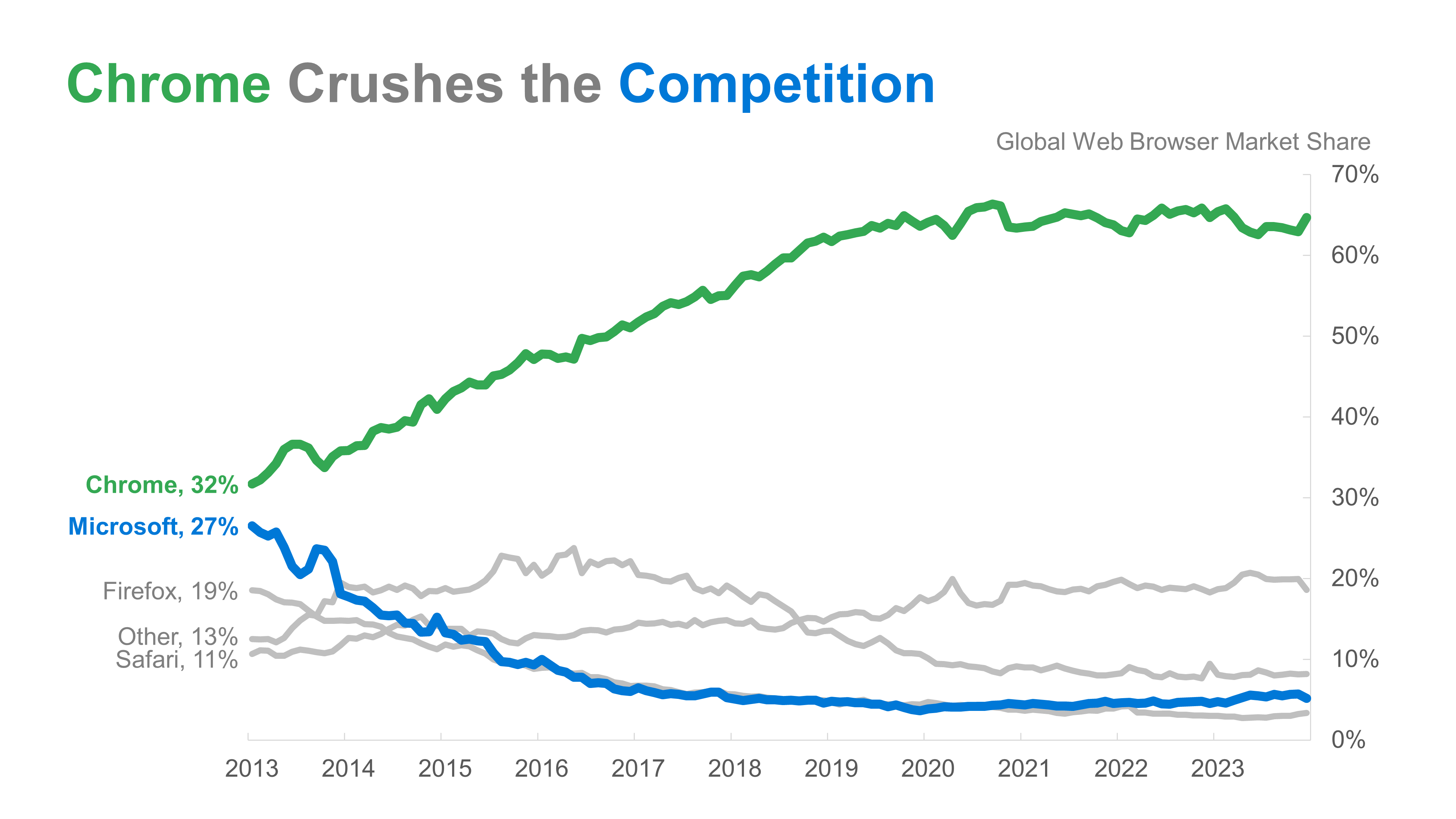
Let’s make those key insights easier to extract by transforming this chart. The version below takes the same information and uses data storytelling best practices in the chart or graph design.
In the improved version, the take-home message is instantly apparent with a concise, descriptive title. The chart is free of clutter and distractions, and color has been used sparingly to focus on the chart components that support the key insight. When every element serves a purpose, the data story shines.
To see the step-by-step transformation of this data visualization, check out these five simple steps to tell a data story.
What are the three key components of Data Storytelling?
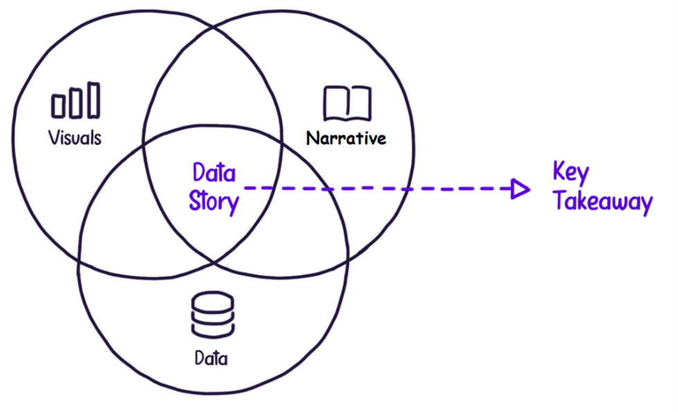
Effective data storytelling, like what we saw above, involves merging three key components that make a message worth remembering: data, visuals, and narrative. Combined, these three elements create a space where our data story’s key takeaway can shine.
1. Data
Data offers the grain of truth that is a grounding force for a powerful and impactful message. Because data shows an event or action, it quickly adds credibility and strength to a message. Without data, a message can seem lofty and unfounded. Good data provides the backbone that makes a message stand tall.
2. Visuals
Most people find data puzzling. visuals, or data visualizations, help. They show patterns and trends that are hard to see.. Through bar charts, line graphs, and other visuals, we can gain valuable insights from how data points behave.
3. Narrative
If data and visuals provide the insight our audience needs, the narrative is the means of delivering that insight. Narrative is how humans naturally make sense of chaos. A strong story with data connects points clearly and effectively. It helps the audience receive, understand, and remember the full picture.
Combining all three, we can create a data story worthy of carrying a meaningful and memorable key takeaway. Together, data, visuals, and narrative can be a powerful force in communication.
How can we start applying data storytelling?
Knowing why data storytelling is important is one thing, but knowing how to apply it and become a data storyteller is another. Integrating data storytelling into how we work should not be rocket science.
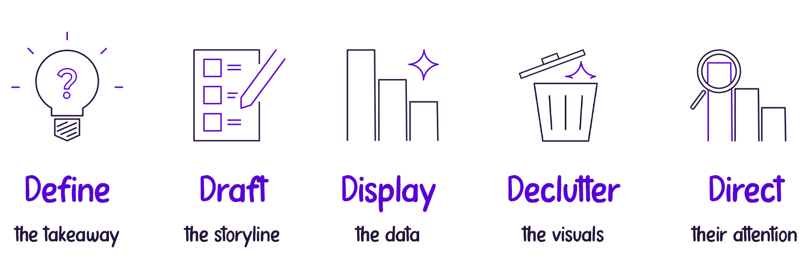
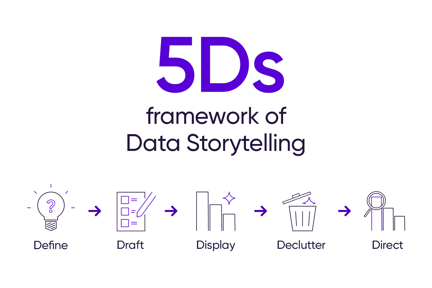
At StoryIQ, we’ve captured the key steps in applying data storytelling to our work through the 5Ds of Data Storytelling:
1. Define the key takeaway.
Like most creative processes, we must begin with the central idea before adding the other parts. This first step encourages us to look at the data’s purpose and defines the compass that will guide the rest of the decisions we make to create our data story.
2. Draft the storyline.
In business, we often need to highlight key messages and data. Drafting a clear storyline helps us do this. It ensures each point connects, making every part important.
3. Display the data.
This is the time to show, not just tell, the story. We must focus on what chart best communicates our insight, not on what looks good to us.
4. Declutter the display.
Charts made in Microsoft Excel or Google Sheets often have unnecessary elements. Removing these makes sure every part of the chart or graph has a purpose. This helps to convey the message clearly.
5. Direct the attention of our audience.
The final step is to apply visual signals to our cleaned-up chart to support the story. By using thoughtful highlights, we can guide the audience to the right areas, making the core idea flow more smoothly.
Want to dive deeper into the 5Ds and apply this in a more comprehensive example? Check our book, Data, Story, Action!
To master the art of Data Storytelling and find other learning opportunities on data communication, check our scheduled workshops or contact us to set up an exclusive class.
Learn with us and earn your certificate in Data Storytelling. See you at our next workshop!


