
You can make useful charts, like sparklines and bullet graphs, to track your company’s performance. You probably didn’t realize you could make these in Excel. I’ll show you how in this blog post.”
Sparklines
First, let’s talk about sparklines. Sparklines are small, simple charts without x- and y-axes or labels. They appear next to text or other elements to give context to metrics. The term sparkline was created by data visualization expert Edward Tufte to describe ‘data-intense, design-simple, word-sized graphics.’ Sparklines have been available in Excel since version 2010, but very few Excel users take advantage of this feature.
Bulletgraphs
A bullet graph is a type of chart that shows a target number, an actual value, and shaded areas that represent good, satisfactory, and poor performance. It was created by data visualization expert Stephen Few as a better alternative to the gauges and meters often seen on dashboards.
How to use sparklines and bullet graphs to visualize company performance
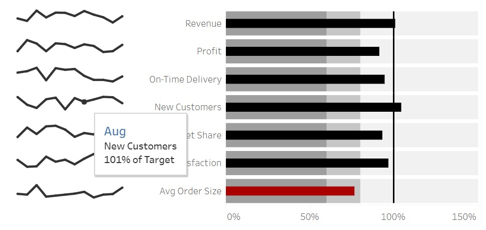
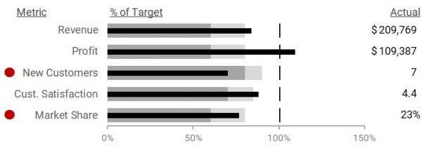
Let’s say your company’s key performance indicators (KPIs) are Revenue, Profit, New Customers, Customer Satisfaction, and Market Share, in that order. Your dashboard might look like this.
The sparklines on the left show your company’s performance in each KPI for the past, say 12 periods.
Each KPI has a bullet graph, with the current period’s actual value shown as a black horizontal bar in the middle and the target represented by a vertical line. This makes it easy to see which KPIs are not meeting their targets—Revenue, New Customers, Customer Satisfaction, and Market Share. You can also see which KPI is exceeding its target—Profit.
The dark gray shading shows the zone of poor performance, the medium gray shading denotes satisfactory performance, and the white zone denotes good performance. In this example, Revenue, Profit, and Customer Satisfaction are good, Market Share is satisfactory, and New Customers is poor.
You will also see a red dot on those KPIs that are not reaching the good zone, in this case New Customers and Market Share.
Finally, you also see the current period’s actual values on the right.
How to create sparklines in Excel
Now that you know how to use sparklines and bullet graphs, let’s walk through creating them in Excel. I’m using Excel on an Office 365 license, but you can also do this in versions 2010 or 2013.
The first step is to prepare your data. For sparklines, create a table that lists each KPI’s or metric’s percentage of target achievement for the past 12 months. Next, go to the cells where you want to insert sparklines and select Insert – Sparkline from the menu.
How to create bullet graphs in Excel
Now that you have your sparklines, let’s create the bullet graphs. These bullet graphs are actually horizontal bar charts of different lengths that overlap.
First, prepare your data in the format shown below. List your KPIs or metrics from least important to most important, along with their current period targets, actuals, percentage of target achieved, and thresholds for satisfactory and poor performance.
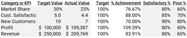
Next, create horizontal bar charts and make them overlap. Place the Actual bar on a secondary axis, then sort them in the Select Data Source window in this order: Target, % Achievement, Satisfactory %, and Poor %.
Then, use conditional formatting to make red dots appear next to a metric when its % Achievement falls in the Satisfactory Level.
It’s not about the tool—it’s about how you use it.
And there you have it! You’ve just used Excel to create sparklines and bullet graphs to track your company’s performance, using simple tools like horizontal bar charts, conditional formatting, and the Brute Force Excel Method.
To learn more about data storytelling and other learning opportunities related to data communication, check out our scheduled workshops or contact us to set up a special class.
Learn with us and earn your certificate. See you at our next workshop!