
Combo charts are frequently utilized, but their potential is often untapped. In many cases, a simpler chart with separated data can deliver a clearer message. Let’s examine a recent example and discuss improvements:
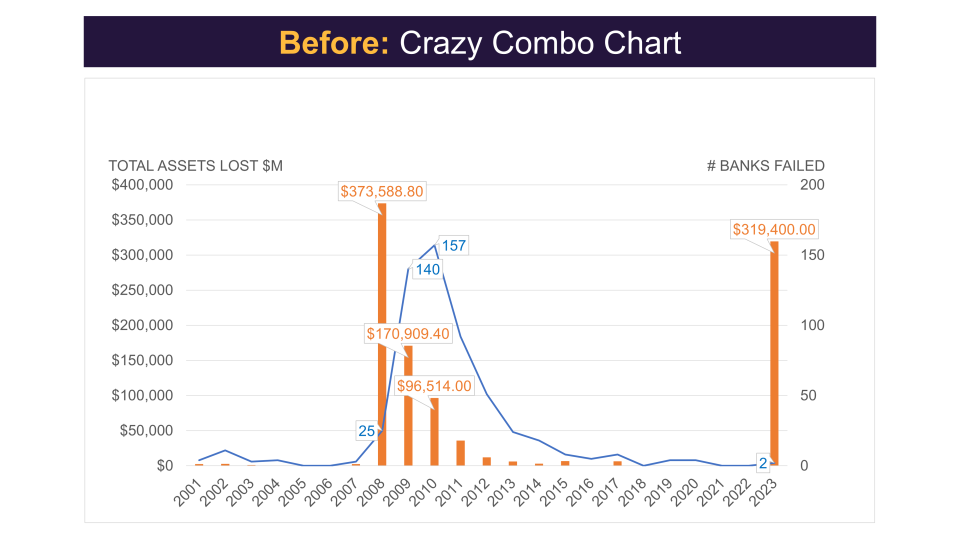
This chart contains valuable data, but it requires some refinement to create a compelling visual story. We’ll walk through several steps to transform the chart.
Define the Key Takeaway
From this chart, we observe that financial losses in 2023 resemble those of the 2008 global financial crisis. However, only two banks have failed so far in 2023, compared to 25 in 2008. Our key takeaway should emphasize the difference in the number of failed banks and the financial losses.
Refine the Chart’s Design
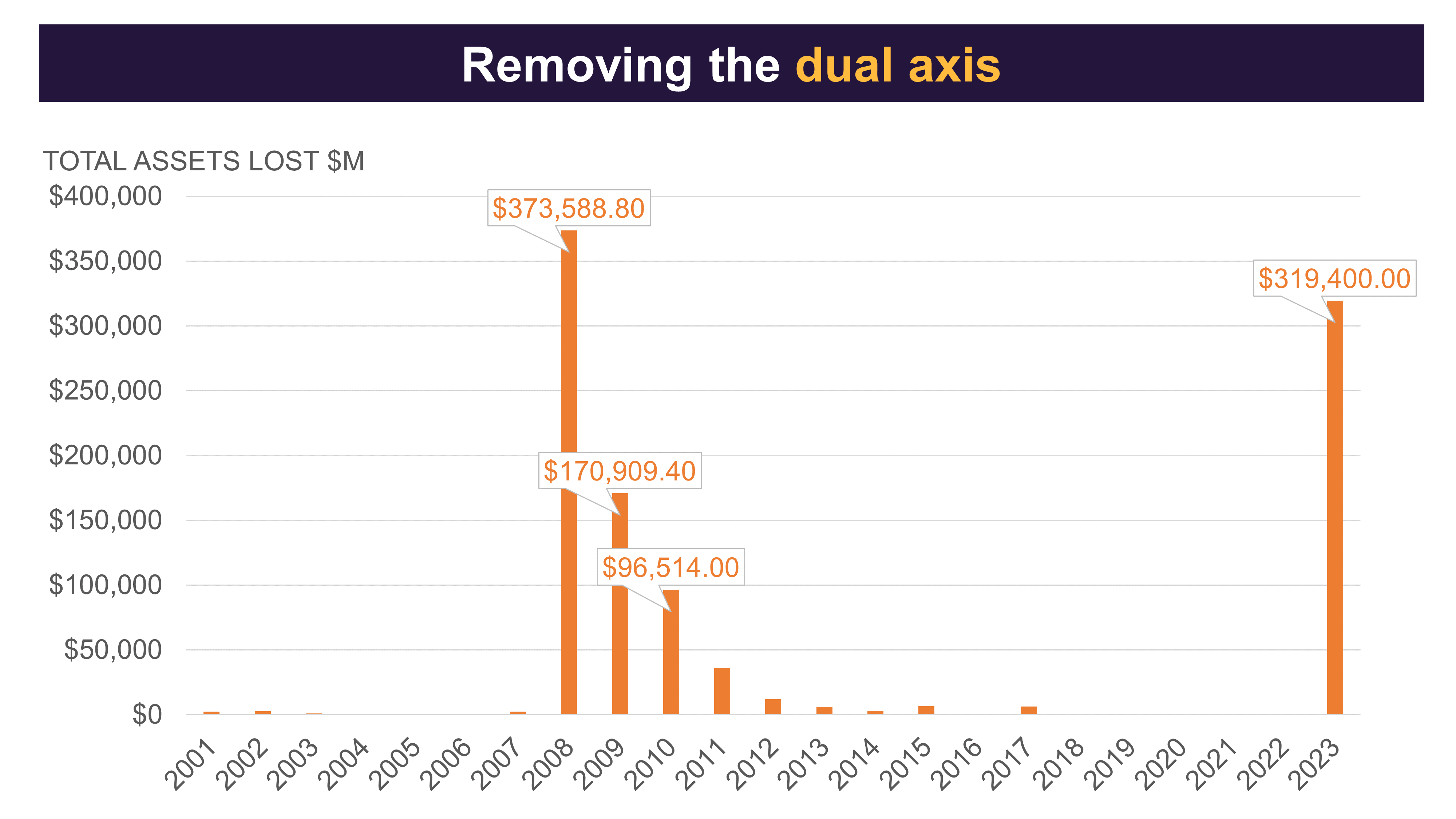
With the key takeaway in mind, let’s improve the chart’s appearance. First, convert the dual-axis combo chart into a standard bar chart. We’ll reintroduce the bank failure data later.
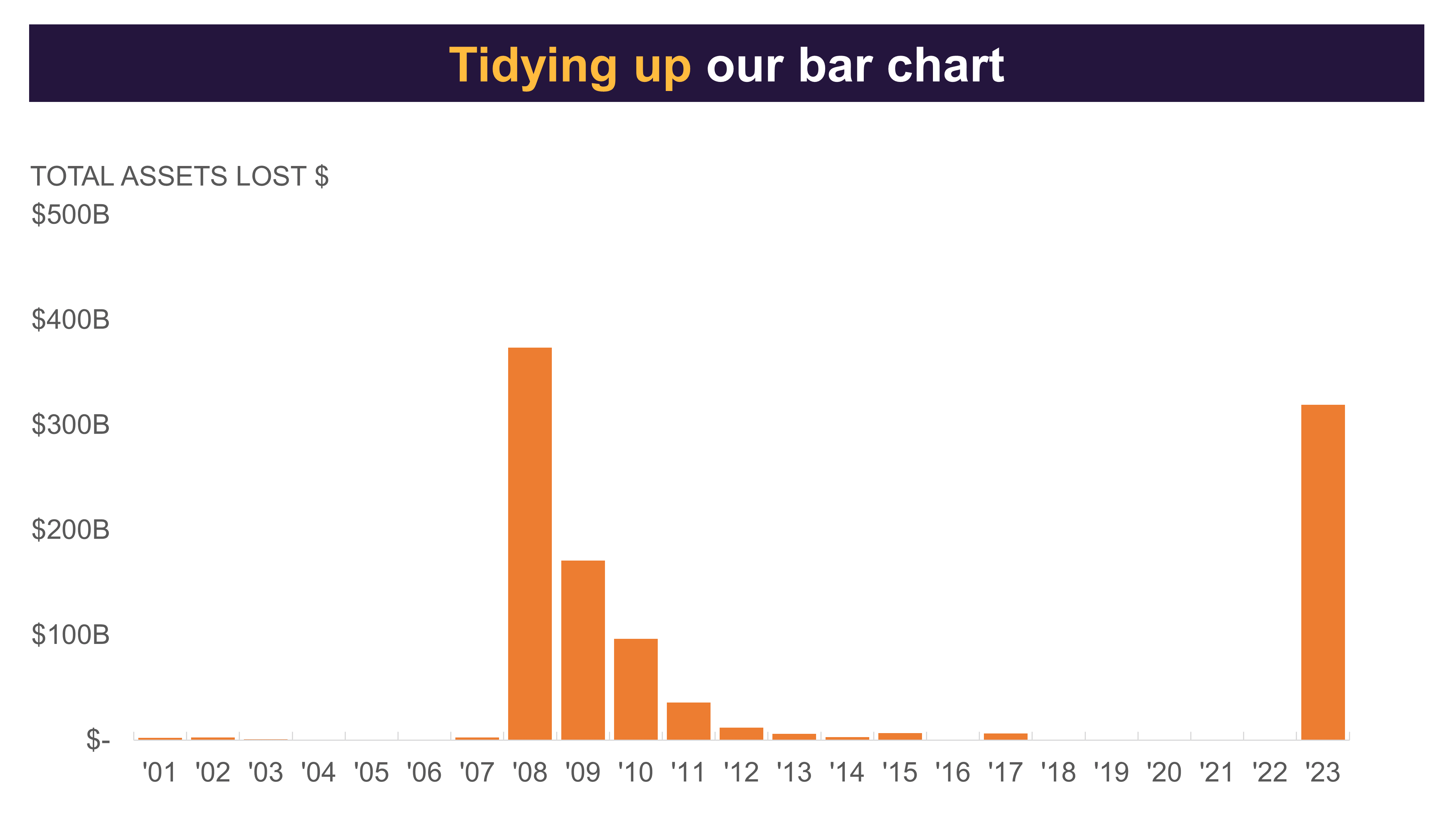
Improve the Bar Chart
Now that we have a bar chart, we can enhance its presentation by:
- Removing cartoonish data callouts
- Adjusting the x-axis label to fit on one line
- Changing the y-axis from millions to billions for a more concise display
- Removing gridlines, as they add visual clutter
- Increasing bar thickness for better visibility and aesthetics
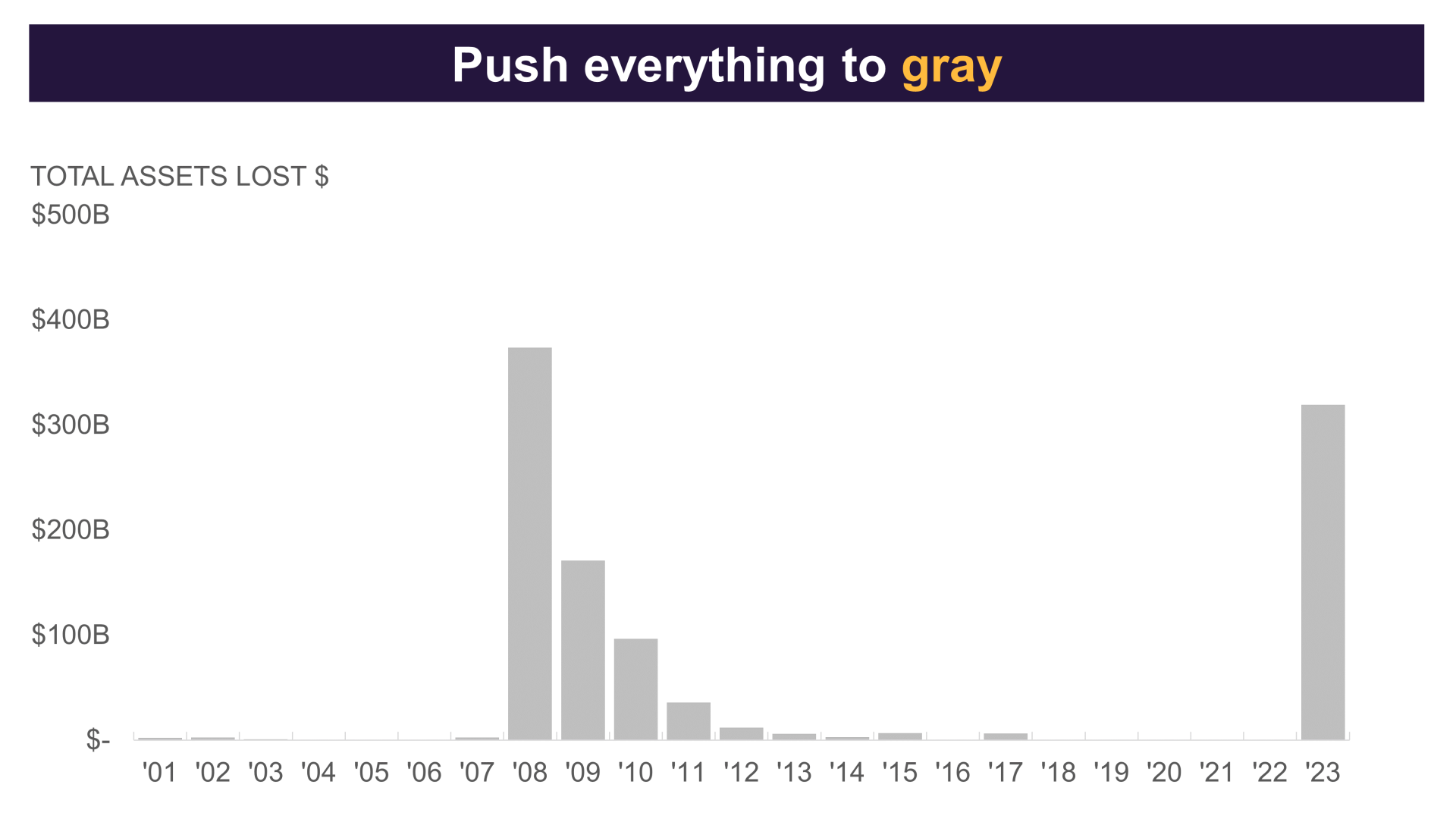
Push to Gray
To emphasize the key message, use strategic highlighting. First, make all chart elements gray. This is a great way to ensure we only highlight the key areas we need later.
Highlight Important Data Points
With all the chart elements in gray, we can start highlighting the important areas. We want to draw attention to the 2008 global financial crisis and the current situation in 2023 by highlighting those bars.
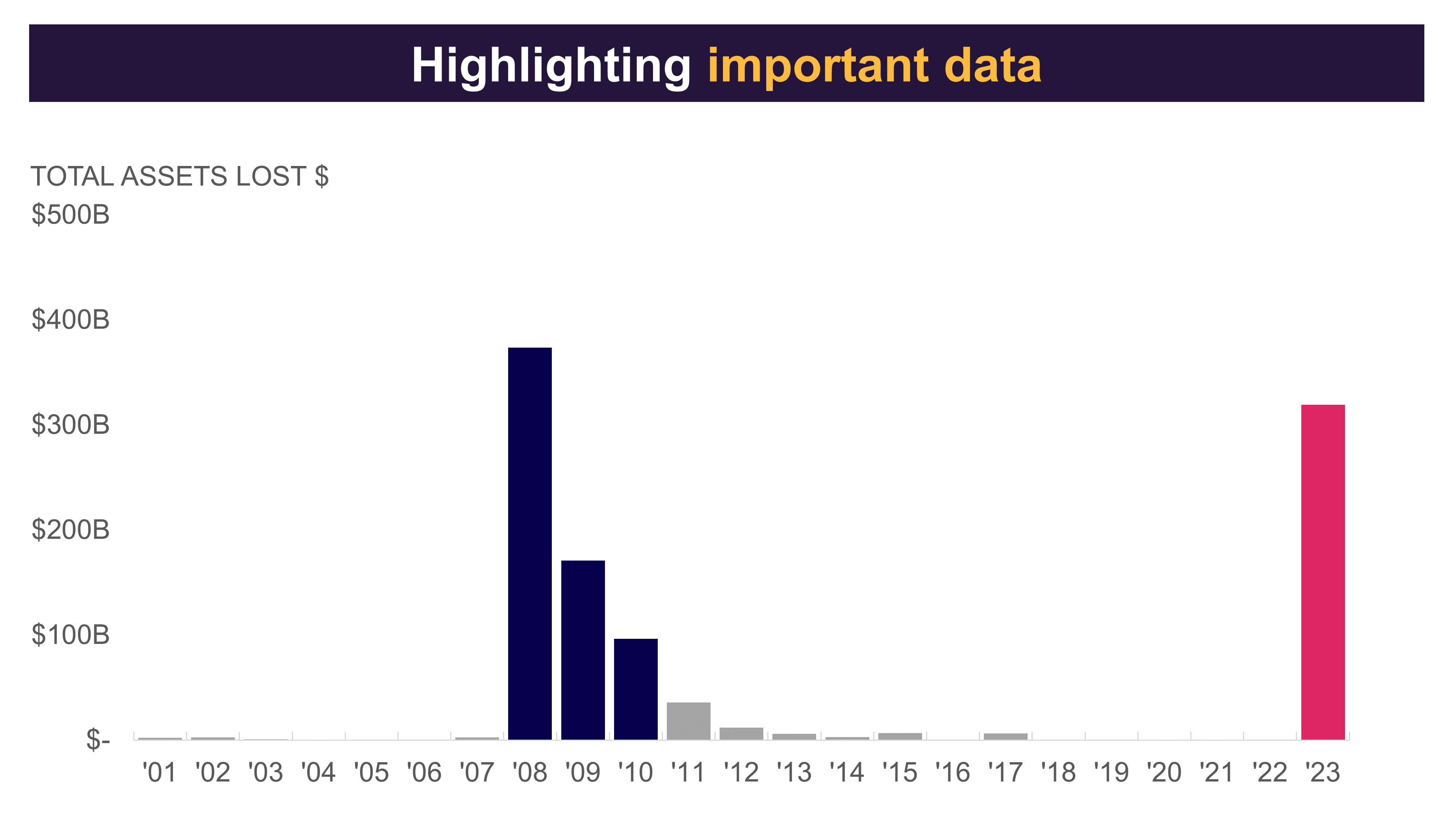
By using distinct colors for 2008 and 2023, we emphasize that they are separate events. Our final step will be to add annotations to the chart.
Annotate the Chart
In our final step, we’ll reintroduce the bank failure data that was removed earlier. By annotating the chart, we eliminate the need for a dual-axis combo chart and make the key takeaway clear for our audience.
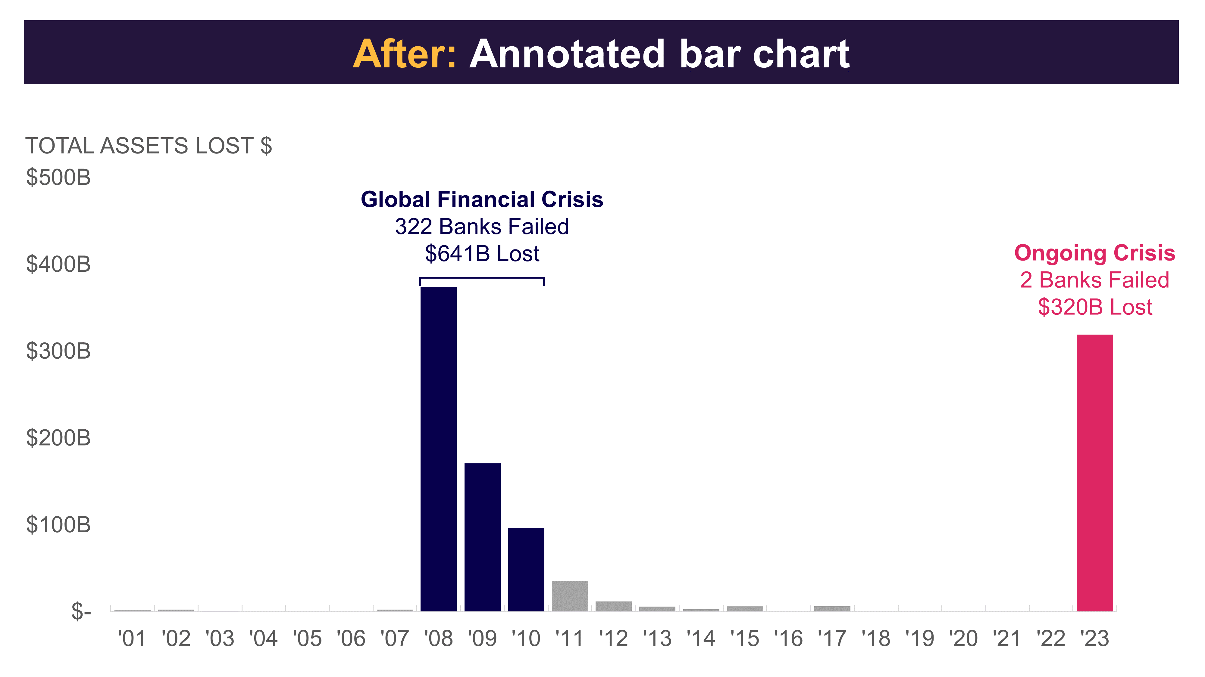
The final chart clearly shows the number of failed banks during the 2008 financial crisis and the related financial loss. It also makes it easy to compare with the 2023 crisis.
Conclusion
You don’t always need a dual-axis chart to show two data sets. By using a single-axis chart with highlights and notes, we can guide the audience to the main point and keep the chart clear and visually appealing.
To learn more about data storytelling and other learning opportunities related to data communication, check out our scheduled workshops or contact us to set up a special class.
Learn with us and earn your certificate. See you at our next workshop!