


Data Storytelling 101: How to Tell a Powerful Story with Data
Explore tips and examples to effectively tell a story with data for business users.
What is data storytelling?
Data storytelling is the presentation of data with a clear storyline and compelling visuals that resonate with your audience.
Why is data storytelling important?
Data storytelling bridges the gap between two concepts that are often not connected or taught together: data analytics and communication. Raw numbers and complex data analysis can seem intimidating or confusing, especially for audiences who are not analysts or data scientists. Using visuals with a clear narrative can make the data much more approachable and understandable.
Data storytelling is a powerful tool or skill that compels people into action. In a data-driven world, it is important to effectively communicate your point in an engaging and memorable way that resonates with your audience or stakeholders. Using data and turning it into a story with visualizations to highlight a key point can improve understanding and make the information memorable, which can then help the audience act on your recommendation.
For example, have you ever seen data visualizations that look like this during analysis?
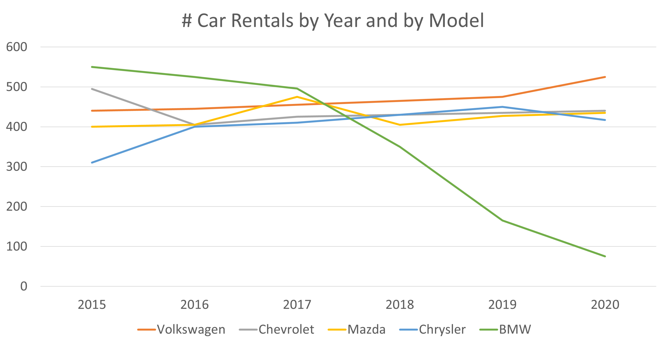
How would your boss or senior executives interpret this, and how might it inform their decision-making? They might be aware of the general downward trend of rentals for BMWs, but the other lines clutter the insight. Ultimately, they would have to work hard to interpret this chart.
What if we apply a few best practices in visualizations and data storytelling to transform this chart?

How much more confident would your stakeholder feel using this chart to make data-driven decisions? Simplifying the chart design and spelling out the key takeaway makes life much easier for the audience. What we’ve done is tell a story with data or data storytelling.
Data storytelling is an excellent starting point for data literacy and analysis education. StoryIQ’s 5D’s of Data Storytelling framework is a helpful guide you can put to use immediately to level up your data storytelling game Start integrating these techniques into your next presentation and see the difference.
Without data storytelling, critical insights remain buried in spreadsheets or long reports, leading to poor data-driven decision-making.
What makes a good data story
A data story has three key elements: audience, narrative, and visuals. A good data story acknowledges each of these elements with intention to create momentum within the organization.
- Audience: a good data story tailors the structure in a way that resonates with the audience. It considers the audience’s background, comfort with data, and skepticism for the key takeaway so they are ready to take action.
- Narrative: the narrative of a good data story is based on what we know about the audience. For example, a more skeptical audience may need more data in a data story than an audience that already agrees with the recommendation. A good story considers how to lay out the information and in what order, so the audience feels inspired to act.
- Data and visuals: a good data story has engaging visuals where the key takeaway is easily interpreted. Data is analyzed, and the right metric is calculated and displayed in a visual that best shows the data. These visuals can be data visualizations like charts or graphs or visual cues like pictures, icons, or impact metrics. Good data visualizations are easily interpretable at a glance, setting our audience up for success.
How can we improve our data storytelling skills?
In a context where data analytics and visualization technology constantly evolve, it can feel intimidating to consistently stay in the know about the latest and greatest. However, there are a few consistent habits a data storyteller can enlist to improve data storytelling skills continually.
- Learn from examples: seeking examples of data storytelling can help you stay inspired and informed. Check out our favorite list of 5 great examples of data storytelling.
- Continuous Learning: the internet holds a host of free tools and resources to keep your data storytelling game strong. Subscribe to StoryIQ’s newsletter or check out a public run to keep learning with us.
- Feedback: not every person will see the same thing when looking at a visualization. It is important to seek feedback from peers and supervisors to ensure visualizations resonate with an audience and make sense.
- Practice, practice, practice: the best way to practice data storytelling is to do exactly that – practice. Try using open-source data to put your skills to the test or challenge yourself to create alternative visualizations that can make your insight shine.
Which tools are best for data storytelling?
There are hundreds of tools that can support data storytelling. We often get asked about the best tools to use. The answer is that almost all modern software can get the job done as long as you’re using the right type of software for the job.
Generally, data visualization tools fall into three categories:
- Spreadsheets are the most widely available tools, with Microsoft Excel alone estimated to be installed on a billion computers. They are user-friendly and integrate well with other commonly used software. They’re ideal for users who do not require the advanced business analytics capabilities of more sophisticated BI tools. Examples of these tools include Microsoft Excel, Apple Sheets, and Google Sheets. Most of the charts on our website were made with Excel.
- Business intelligence (BI) and dashboarding platforms are comprehensive data analysis and visualization solutions. They are often used for creating interactive dashboards, reports, and data models. They are powerful in handling large datasets and offer interactivity so users can drill deeper into your data stories. These tools are especially efficient for producing a report or dashboard that will be re-produced regularly or even updated in real time. Examples of these tools include Tableau, Microsoft Power BI, and Qlik.
- Advanced tools are a broad category for users with programming skills. Examples include programs like R, Python, and Stata or coding languages like D3.js. They offer extensive flexibility and power for data analysis and creating custom visualizations. They’re particularly suitable for complex, unique data analysis tasks that require more than the standard visualization types offered by other tools.
How do we tailor data stories to our audiences?
When we are crafting data stories, it’s tempting to position ourselves – the data storyteller – as the hero of the story. This might seem natural, given that we are the ones who have done the heavy lifting, crunching the numbers and delivering the key takeaway that will save the day. But this is not the right approach!
The true hero of our data story isn’t us; it’s our audience. They are the ones who will take our data story and translate it into action, shouldering the risk and effort that comes with owning and executing decisions in the real world. By positioning your audience as the hero, you focus attention on their decision-making power, making it more likely that your data story will result in real change.
- The Audience: A tailored and clear data story starts with the audience. Consider what kind of audience you are facing (peer, manager, leadership) and whether they belong to an internal team or if they are external stakeholders. Their role, background, and what they care about can help you prioritize and decide what insights you need to feature. Understanding the audience will directly inform the message and the approach you take to deliver that message.
- The Key Takeaway: Consider the key takeaway to communicate or craft a narrative around and link it to why that message is important to your audience. The Situation, Complication, Resolution (SCR) framework, made famous by former McKinsey consultant Barbara Minto, can help define the key takeaway.
- The Approach: Considering how skeptical your audience might be about the key takeaway or valuable insights and how comfortable they are with the message can be an effective way to determine how to tell your story. Think about what data and context are necessary to deliver the message effectively, as well as what the message’s primary purpose is. For instance, are you there to inspire them and invite reflection? Or are you there to propose solutions and persuade them toward the best course of action? Or are you simply expected to inform them of the findings to keep them abreast of the situation? The purpose of your message will guide you in developing the tone and the content of your data story in a way that is appropriate for the context.
- The Medium: It may also be possible that there are more effective ways to communicate with the audience than a presentation. Considering the right presentation medium can be an effective way to tailor a message.
What are the common pitfalls in data storytelling?
Data storytelling is a powerful technique, but it is not without its challenges. Here are some common pitfalls to avoid when telling stories with data:
- Overcomplicating the story: Nobody likes to listen to someone ramble on and on about every minute detail – and we all probably have that person in our lives who does! The same is true for our data stories. While packing your data story with every piece of information may be tempting, overloading a story with too much data can confuse the audience and dilute the impact of your message.
- Ignoring the audience: Creating a data story without first considering the audience may lead to a non-targeted data story that does not inspire action. It is important to consider what the audience knows, what they need to know, and how the data relates to them.
- Overlooking the call to action: A data story should ideally lead to a conclusion or a call to action. Failing to provide a clear conclusion or actionable insight can leave the audience uncertain about the story’s significance – and, even worse, concerned it was not a good use of their time.
- Using Over-Complicated Visualizations: While using a complicated visualization might look aesthetically pleasing at first glance, it can often overwhelm an audience, especially if they are in a rush, are unfamiliar with the data, or are not comfortable with data analytics.
How to measure an effective data story?
The ultimate metric for gauging the successful data storytelling is when the audience is moved to act based on what was put forth. In other cases, it could also be when they feel empowered to communicate and discuss with others the insights they have learned. The ability to act and enrich discussions based on the data story proves that the insights were relevant, clear, and memorable.
There are a few ways to ensure the presentation will be effective before, during, and after the data story.
Before the data story
- Talk to your audience: Having conversations with the audience about the topic ahead of time can give you an idea of where they stand regarding familiarity and skepticism with your point.
- Seek buy-in from leadership: Enlisting someone with a high degree of influence over the topic can also help secure buy-in during the session.
- Connect with related initiatives: Linking your data story with timely and related initiatives can help secure momentum and buy-in.
During the data story:
- Seek real-time feedback: Asking questions and building points for interactivity can reveal points of contention or agreement in real-time.
- Keep the audience engaged: Polls, activities, discussions, and other interactivity techniques can keep your audience from being distracted during the session.
After the data story:
- Seek post-session feedback: Sending a feedback survey or having follow-up conversations with the audience can help gauge what information was retained or if action was taken.
- Package key takeaways: Sending a write-up of the key points in an easy-to-digest way can help keep the message top of mind. A short email or a visual one-pager can get the job done.
To become a data storyteller and learn how to get key insights from data, check our scheduled workshops or contact us to set up an exclusive class.
Learn with us and earn your certificate in Data Storytelling. See you at our next workshop!