Our audience’s needs should guide every choice we make in data storytelling. We need to ask ourselves: What does our audience need to know? What do we want them to take away from our data story, and what action do we want them to take next?
Sometimes, we’re lucky, and our raw data is in great shape. All we need to do is select and configure the right visualization, and we’re ready to start crafting a story that adds value for our audience. But often, the data we have isn’t ready to present. Frequently, the metrics in our raw data set aren’t the best ones for showing the insights that will be most valuable to our audience.
Defining Metrics and Dimensions in Data
So, what do we mean by metrics, and how do we choose the best ones to tell our story?
Let’s look at an example. A company wants to see if it’s getting value from its marketing spend. The table below shows the raw data available to the analyst:
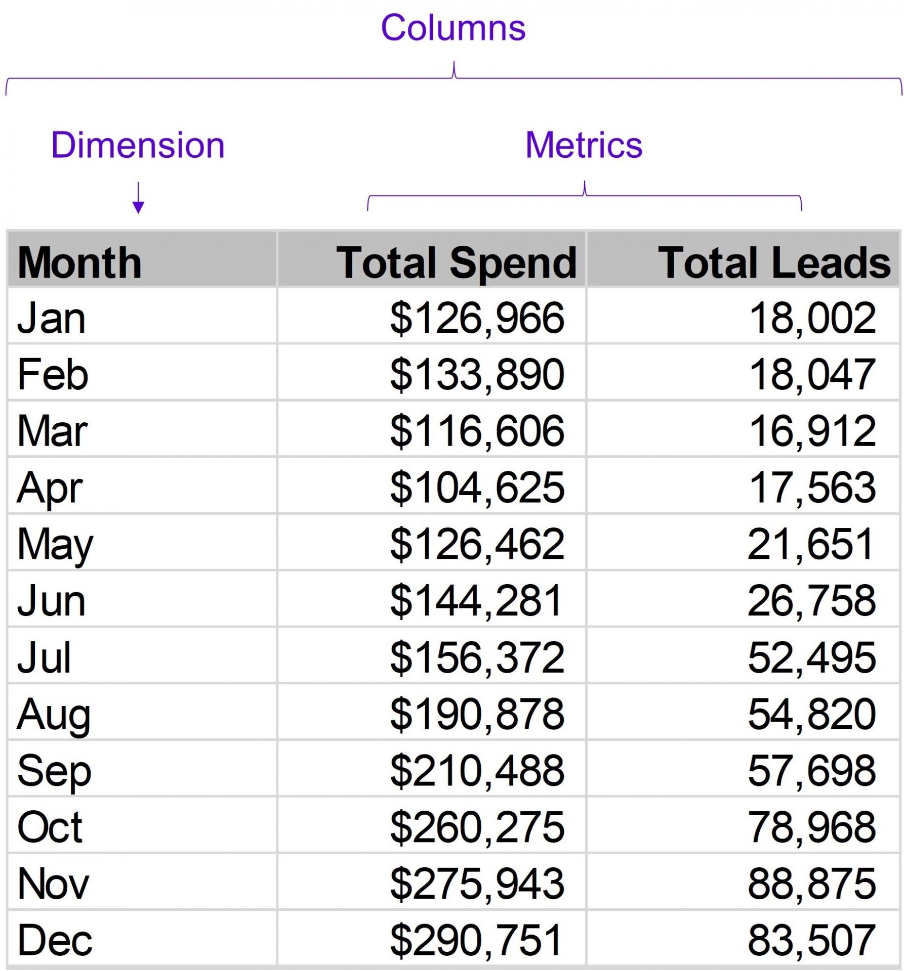
The data set contains three columns:
Month – the month of the year.
Total Spend – the total spend on marketing efforts each month.
Total Leads – the number of new leads the firm has acquired each month.
The “Total Spend” and “Total Leads” columns in the above table are both metrics. Metrics are quantitative values that can be expressed as numbers. They allow us to measure something of importance to us.
The “Month” column isn’t a metric because it doesn’t have numeric values. Instead, it’s a dimension—a column that holds categories we can use to break down our data. In this case, it represents time.
Translating Raw Data into Insightful Visualizations
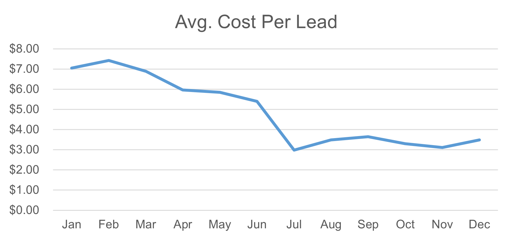
Our table of data already contains some metrics. Of course, it’s hard to make sense of a large table of data, so we’ll try visualizing the data using a chart. A chart will help us quickly identify patterns and trends in the data. When visualizing trends over time, a line chart is an excellent starting point. Here’s what we get if we select our raw data in Excel and insert a line chart using Excel’s default settings:
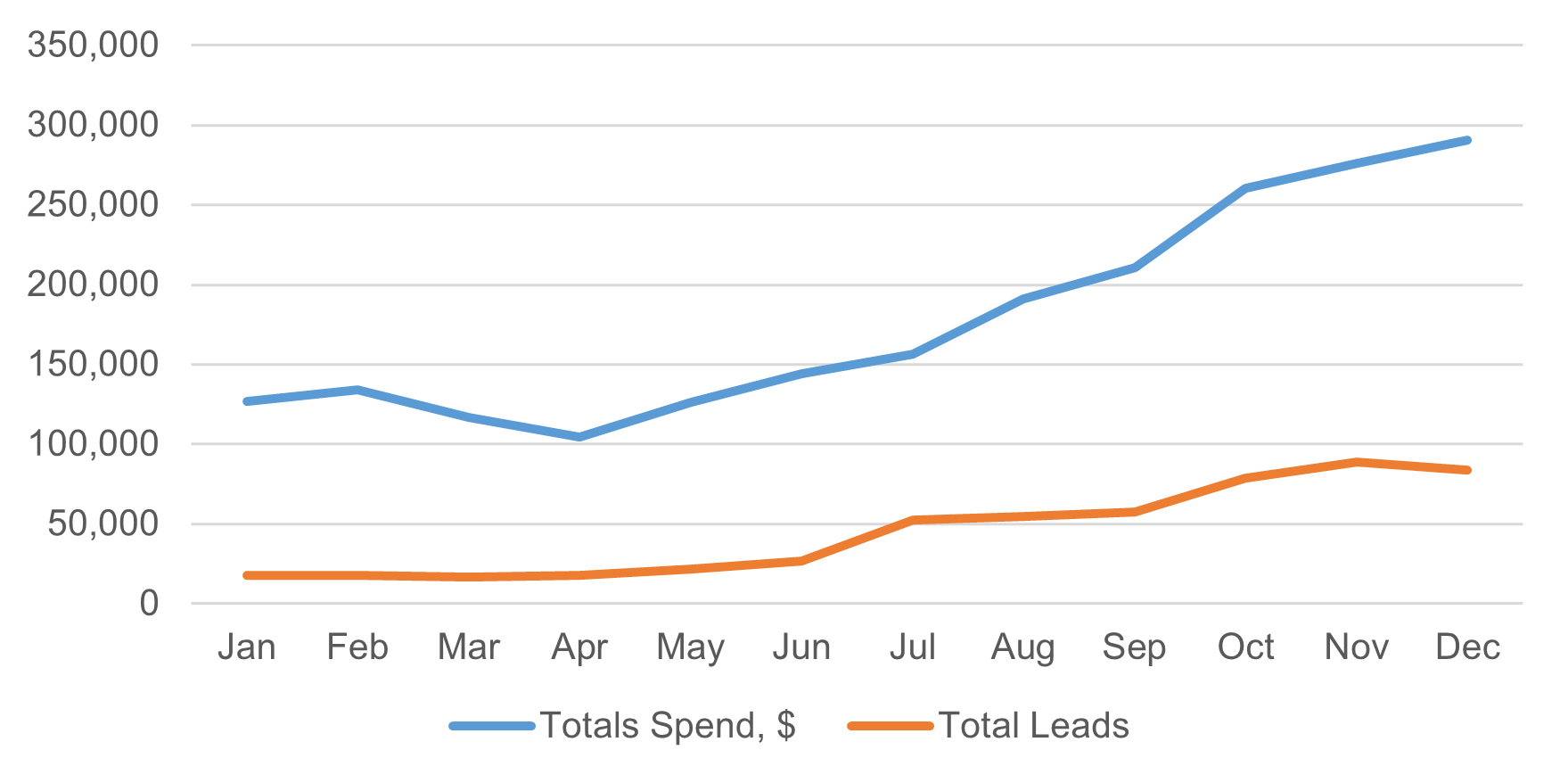
The original question our audience asked is: Are we getting value from our marketing spend? Does this chart help them see the answer? We can tell that we’re getting more leads, but we’re also spending a lot more on marketing. Without doing some math, it’s hard to tell if we’re actually getting better value from our marketing spend. If our audience has to do math to understand a chart, it’s a sign we might need to redesign it. Is there a better metric we could use to help show if we’re getting more value?
One option is to calculate the average cost per lead each month. This new metric, called “Cost Per Lead,” is a new column in our data set. We get it by dividing “Total Spend” by “Total Leads” each month to find the average cost of each lead. Simple data transformations like this can make a big difference in our data story. As we go through this article, we’ll look at more advanced transformations, but all of them are just about choosing the right basic math to use.
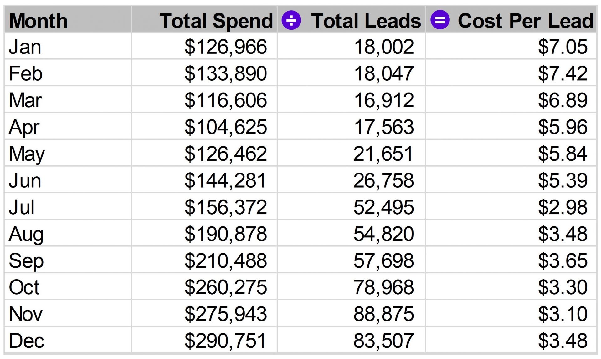
Let’s visualize our newly created metric.
Now we can see a clear pattern: our average cost per lead has dropped a lot and leveled out at about half of what we were paying at the start of the year. We’re now ready to create a strong data story that directly answers our audience’s question about the value we’re getting from our marketing spend. Here’s the chart with added comments and improved formatting:
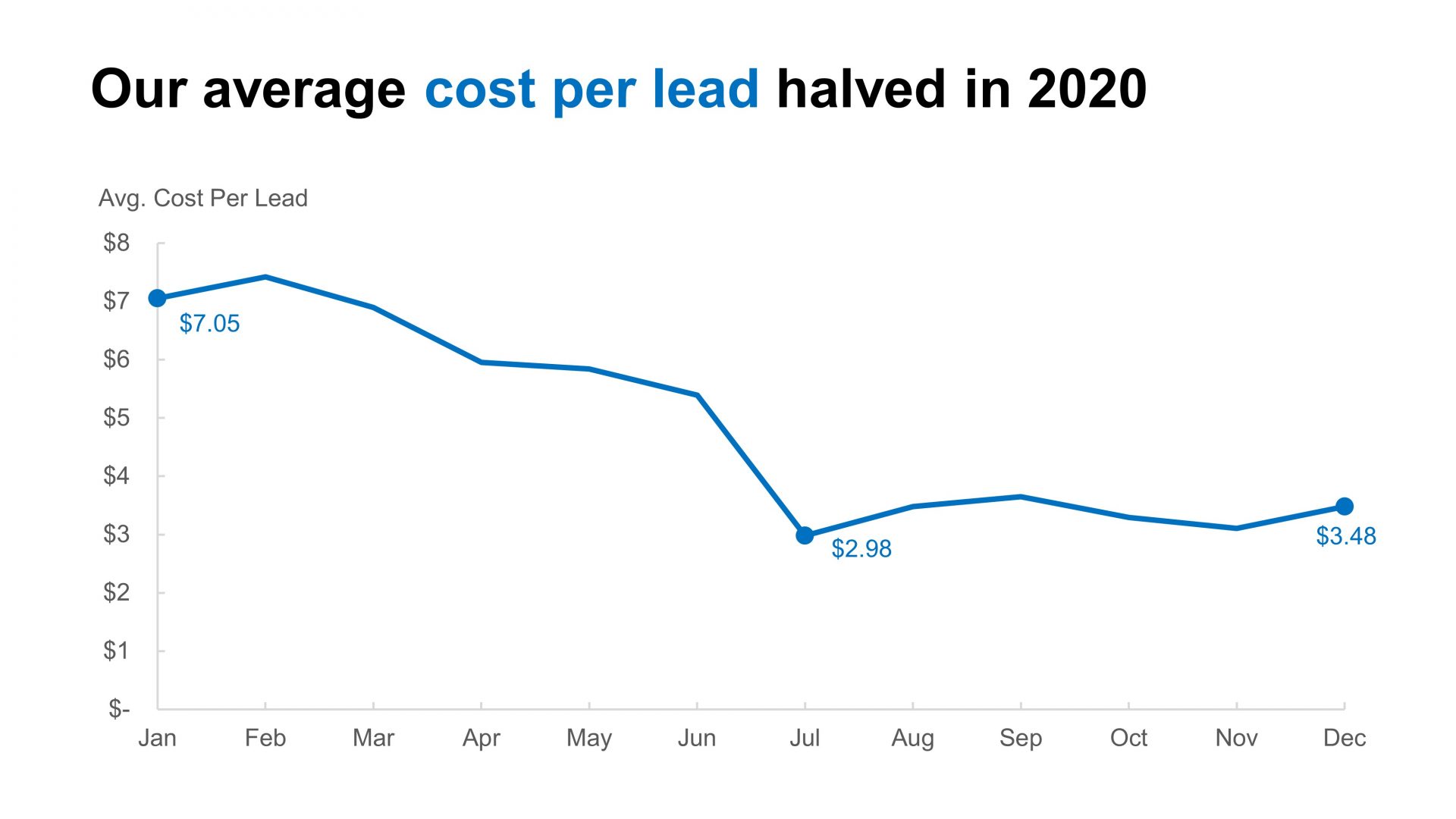
We’ve created a much more useful data story by using simple math and focusing on our audience’s needs.
Dimension selection
Choosing dimensions is closely related to choosing metrics. When we select metrics, we create a new metric column based on the existing metric columns in our raw data. Similarly, when we choose dimensions, we create a new dimension column from the available dimension columns in the raw data.
Let’s look at another example. A theme park wants to understand when peak guest volumes occur to better plan staffing, supplies, and maintenance. They’ve recorded the total number of guests entering the park each day for one year. Here are the first few rows of this data set:
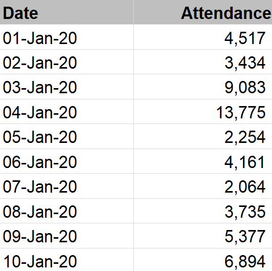
The “Date” column is a dimension, and the “Attendance” column is a metric. If we visualize the whole data set spanning one year using a line chart, we get this:
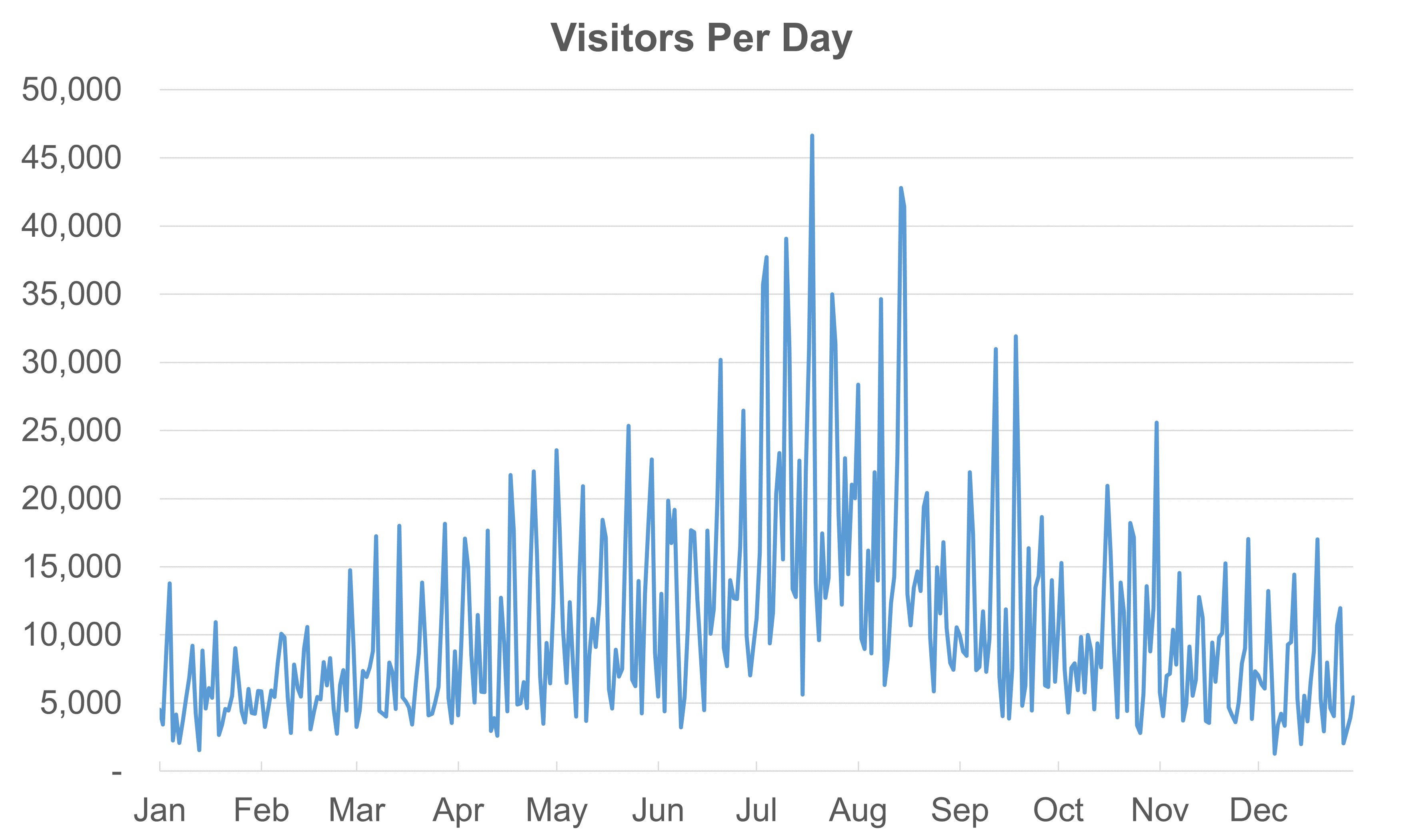
We can see some interesting trends here. There are big seasonal changes, with higher attendance in the summer months of the northern hemisphere. We also see regular spikes, which seem to line up with weekends. But our audience can’t be sure that weekends are causing these spikes just by looking at the chart because the x-axis doesn’t show exact days. To confirm this, we’d either have to guess that weekends are causing the spikes or check the raw data.
To make the data easier to understand, we’ll create two new dimensions from the existing date column: one for the month and one for the day of the week. These new dimensions will let us show how attendance changes by month and by day of the week. Then, we can create two simpler charts like these:
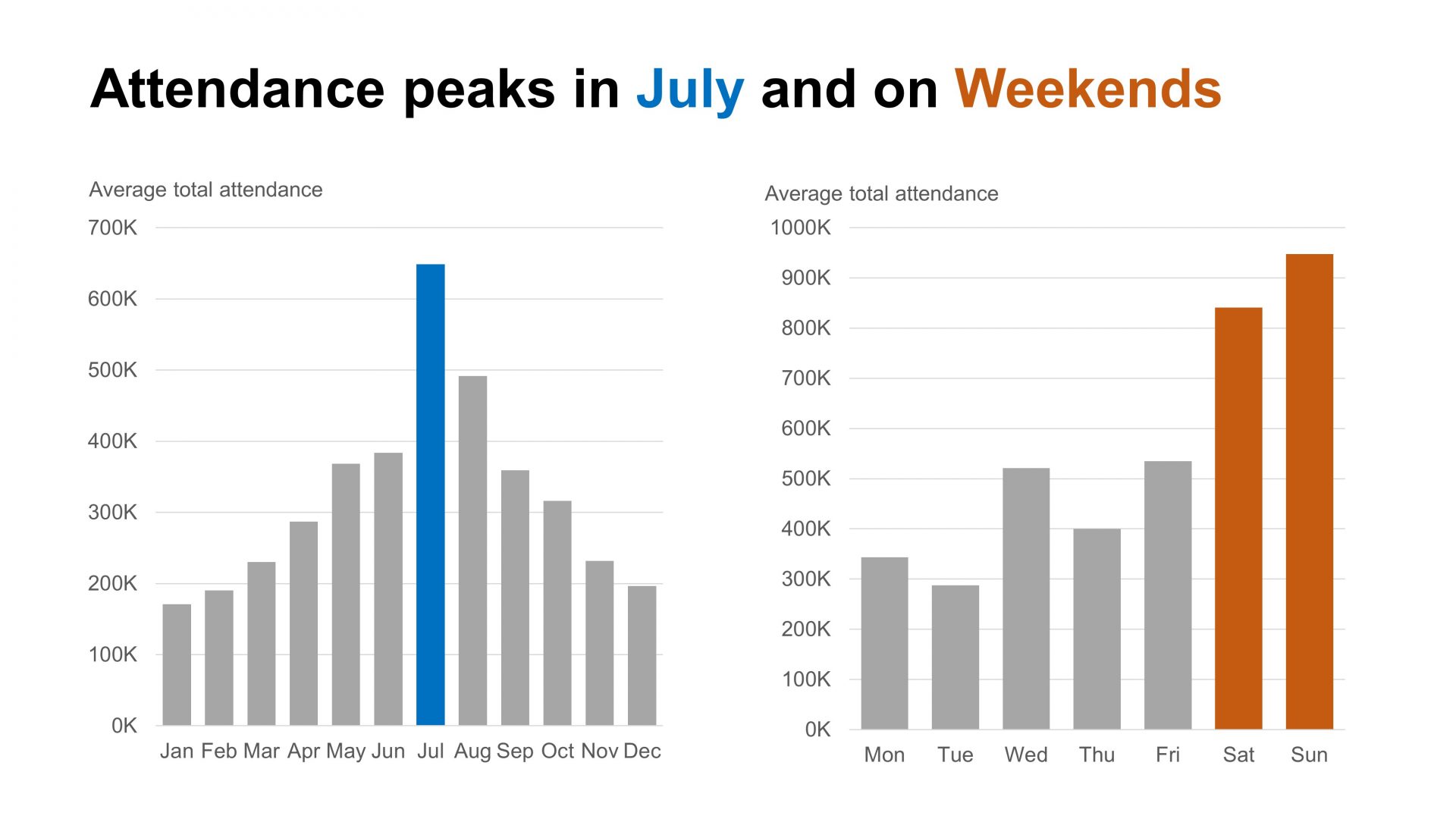
By using the month and day of the week as separate dimensions, we can create a chart that clearly shows how each one affects total attendance. Can we further improve our choice of dimensions and metrics to better meet our audience’s needs? Remember, our audience wants to know when peak guest volumes occur so they can better plan staffing, supplies, and maintenance.
Refining Metrics for Deeper Insights
Metric selection can help us again. In the charts above, we’ve simply added up the total number of people who attended each month or day of the week. These charts give us a high-level view of when the park is busiest, but our audience is most interested in peak attendance levels for planning.
Instead of totaling the attendees each month (which Excel does automatically), we could look at the highest number of attendees on any single day each month. This metric would better help our audience understand peak demand levels.
We could go further by creating metrics that show the maximum, minimum, and average daily attendance for each month:
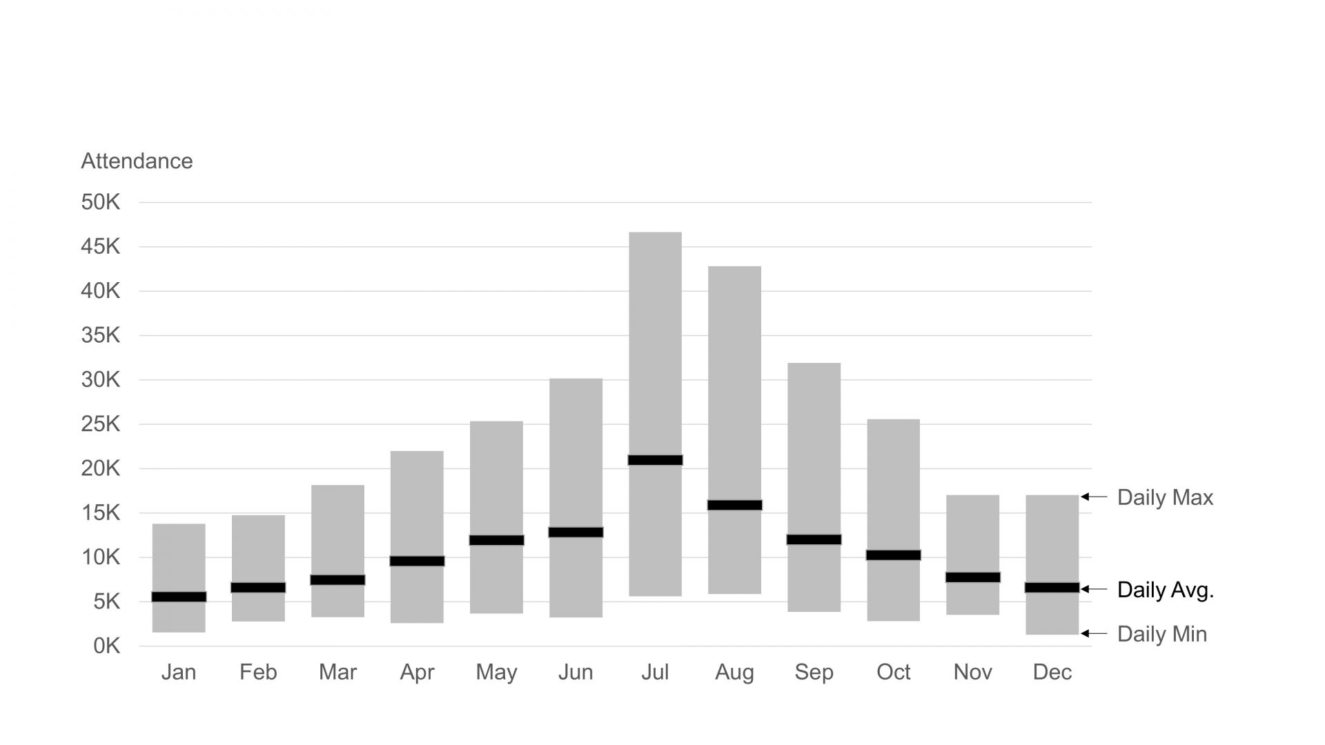
This chart is called a floating bar chart. It can be used to show a range of values from the minimum to the maximum. We’ve also incorporated a dash to show the average daily attendance per month. This chart is rich in insights that are useful to our audience. We can quickly see the peak daily volumes in each month, enabling us to prepare to service those peak volumes. We can also see that planning will be easier in the Northern Hemisphere winter, with a much narrower range of attendee volumes. In the summer, there is a wide range of daily volumes. We’re still going to have some very light days, but we’re also going to have some extremely busy days.
Segmenting Data for More Precise Planning
We can add one more dimension to segment our data set and make it more useful. Let’s add a dimension to segment our data set by ‘Weekend’ versus ‘Weekday.’ Now we’re slicing by two dimensions: the month of the year and whether the day of the week is a ‘Weekend’ or a ‘Weekday.’ For example, in July, there are eight weekend days. We will take the highest of those eight daily values to give us the peak weekend volume in July, which is 46,641 attendees..
Here’s our final visualization, capturing peak weekend and weekday volumes by month.
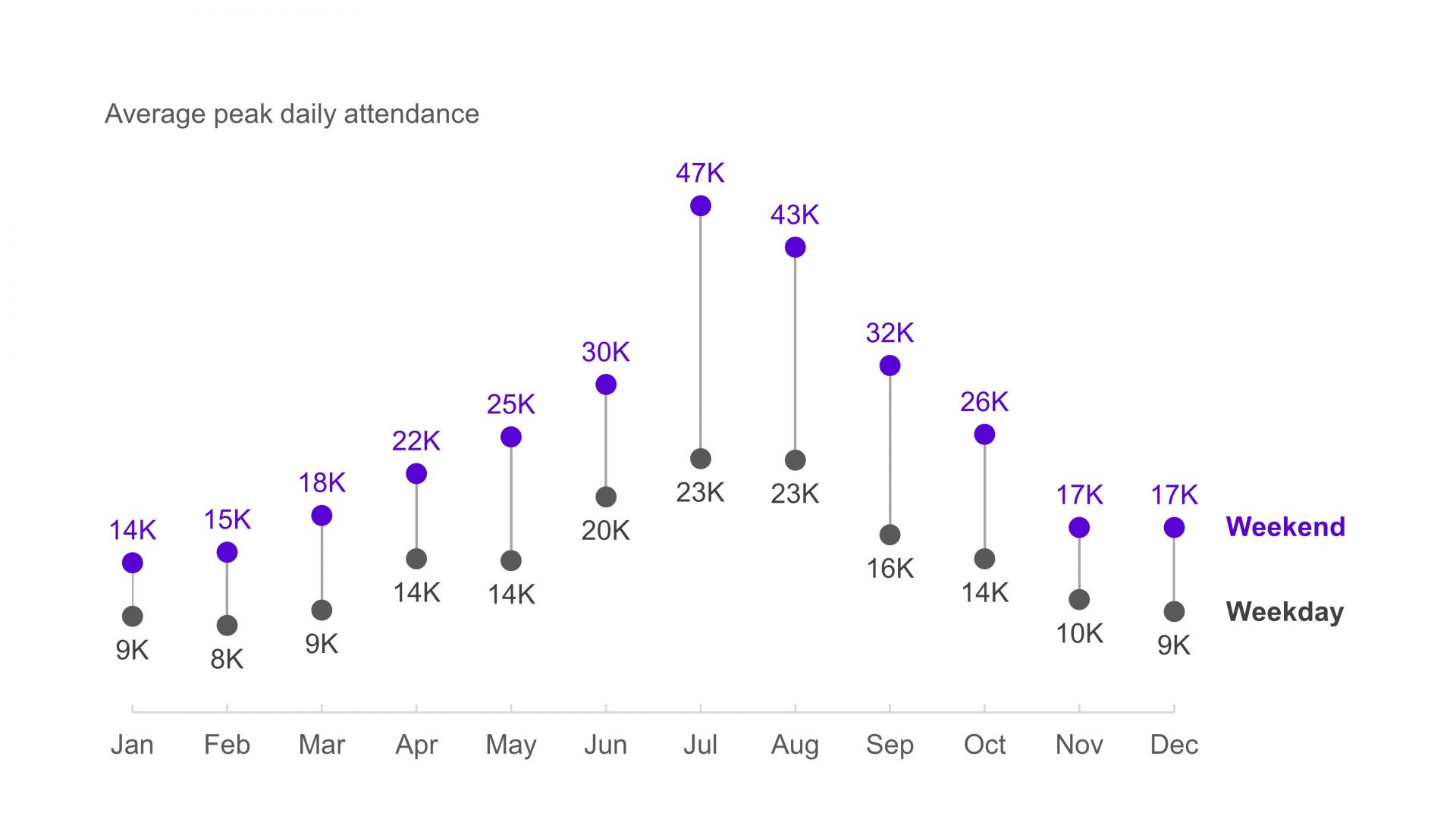
This chart is shown without commentary so management can use it to see peak volumes they need to plan for throughout the year. In this example, we’ve used a dumbbell dot plot. A dot plot, with its clear markers, emphasizes individual values, unlike a line chart, which directs our eyes along a timeline. Since our audience needs to focus on specific peak volumes for planning, a dot plot is an effective way to highlight these values.
Conclusion
As you can see, we’ve made big improvements in our data storytelling by refining the metrics and dimensions in our visualization. Choosing the best metrics and dimensions is an iterative process. We always start with the needs of our audience. Then, we experiment with different visualizations. Each time, we ask ourselves: Does this visualization help my audience quickly and easily get the information they need? We repeat this process, testing new metrics and dimensions, until the answer is a clear yes!
To learn more about data storytelling and other learning opportunities related to data communication, check out our scheduled workshops or contact us to set up a special class.
Learn with us and earn your certificate. See you at our next workshop!