Download the 2026 Brochure
Detailed description and delivery options for our latest courses
Read more about data storytelling, creating impactful presentations and more.
Learn why data storytelling is an important skill. Discover why compelling stories with key insights can help drive smarter business decisions.
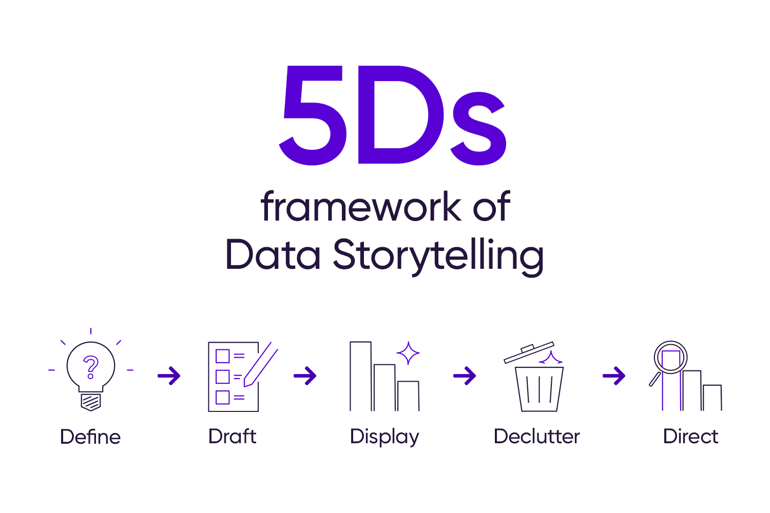
See the transformation of a default chart into a data storytelling slide with the help of StoryIQ’s 5Ds of Data Storytelling.
Here's a rundown of practical tips you can easily apply to make your data visuals better and your story clearer.
Dive into why critical thinking is the most vital skill you need in today’s data-saturated and AI-obsessed era.
Grasp the key components of a data story and begin presenting data using narratives and visuals tailored to the audience's needs.
Craft clear, user-friendly dashboards for your stakeholders with the right metrics, visuals, and spacing.
Level up your reports. Create compelling sparklines and bullet graphs for a clearer view of your company’s performance.
Use the Presentation Medium Selection Framework to identify the most suitable approach to deliver your data story
Color harmony is crucial in designing aesthetically pleasing graphics that ensure clarity and accessibility for a wider audience.
You don’t need fancy charts to improve how you visualize data. Let’s simplicity shine through the ESCape method.
The best way to solve a problem is by breaking it down into manageable parts. This framework can help you map out each issue.
The combination chart might be a favorite of many professionals. But there's a clearer and simpler way to present insights.
A chart isn’t always needed to present data. Use impact metrics to put a spotlight on the metric that matters.
Featuring the right metrics can set a good insight. Discover how to extract and visualize meaningful insights from raw data.
Apply these simple techniques to quickly transform busy slides into a clear, polished presentation for your stakeholders.