

Good dashboard design boils down to 3 factors:
1. Numbers
We need to choose the right metrics for the right audience. Many statisticians and data scientists make the mistake of using overly complex metrics. Instead, try to use metrics that everyone can understand, like averages, proportions, and counts, rather than less common measures like standard deviations and interquartile ranges.
2. Visuals
We need to know when to use a chart versus a table versus “impact metrics.” If we have decided to use charts, we need to choose the right charts for the job. Chart selection should be based on the science of vision and perception (see Cleveland and McGill, 1984, shown below).
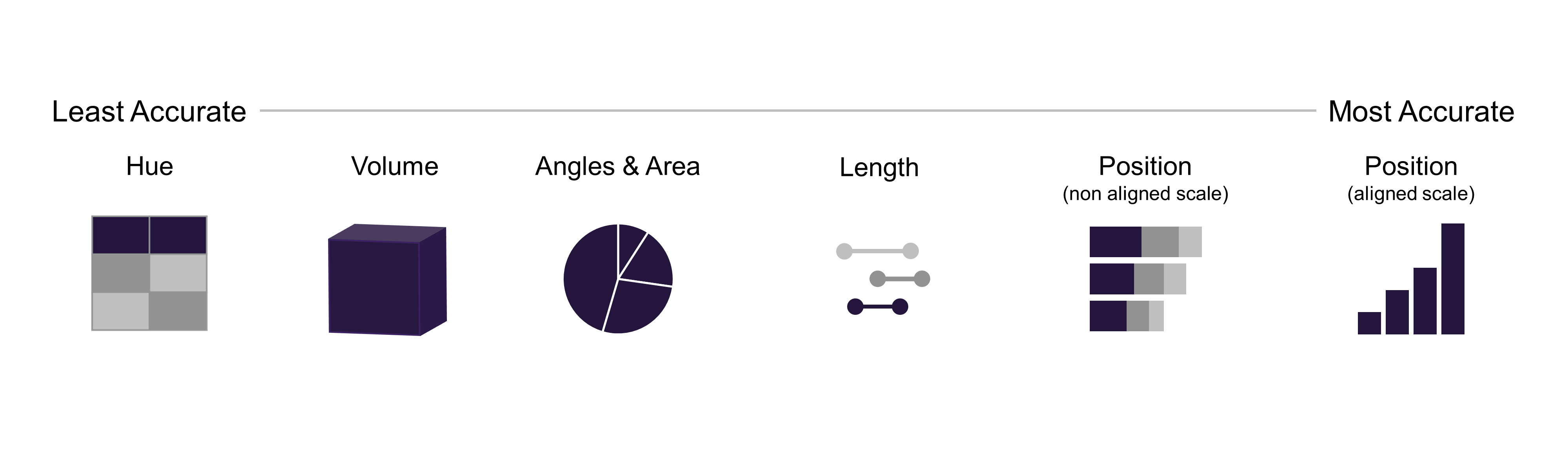
Charts shouldn’t be chosen just because they look good. Once we pick charts based on how people see, we need to keep the design simple—no extra clutter and a focus on showing the data clearly (see Edward Tufte’s work for more).
3. UX and Spatial Layout
Once we have decided on our metrics and charts, it is time to arrange these items in an effective layout. Eye tracking studies by Tableau suggest that humans read dashboards in a “Z” pattern, reading across the top of the dashboard from left to right first.
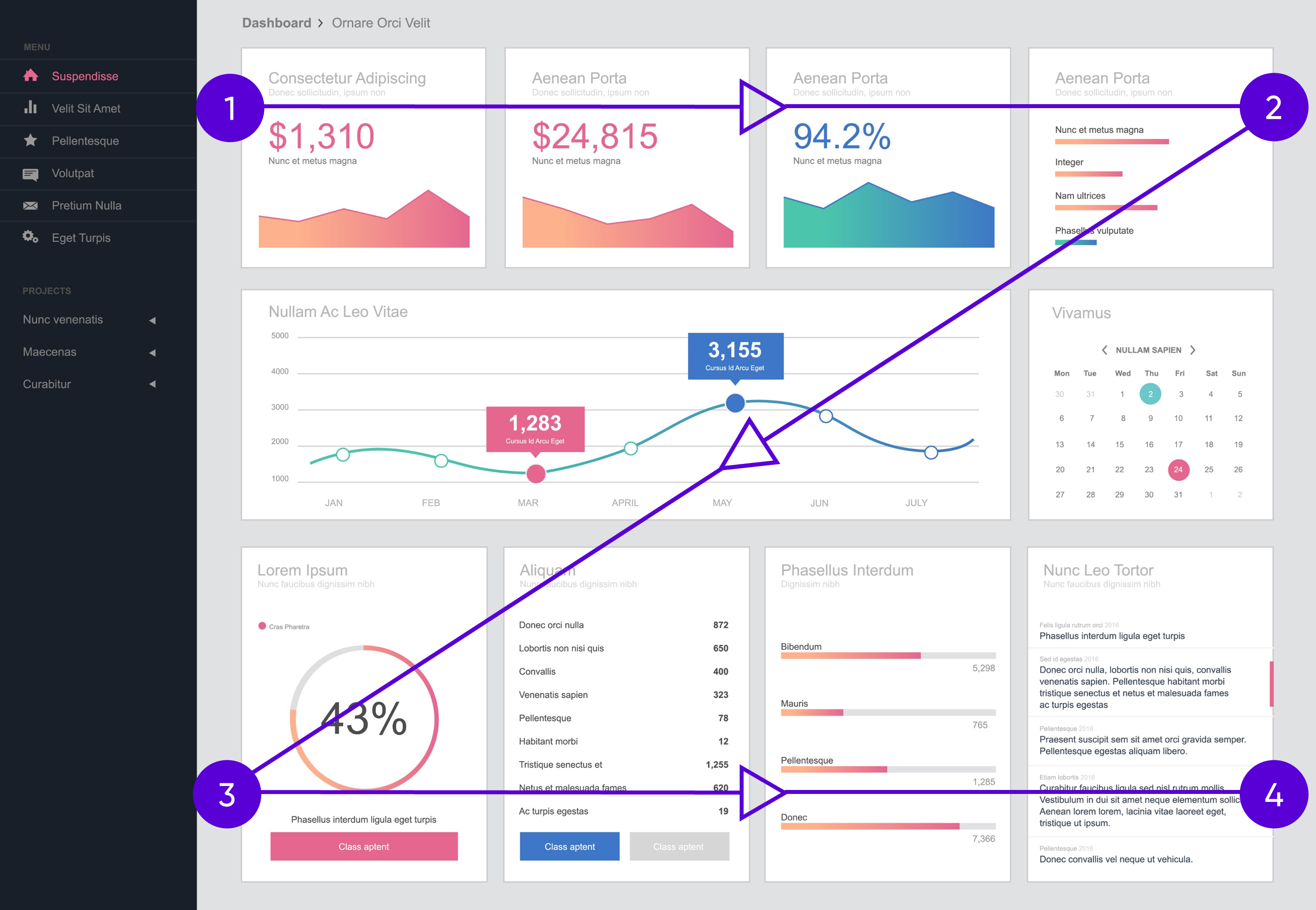
Our most important metrics and graphs should go across the top of the dashboard, with the key numbers in the upper left corner. Next, we should add useful interactivity like tooltips, filters, and highlighting effects. (If you’re using Excel, you may want to upgrade to Power BI or Tableau for these features.) Wherever possible, the dashboard should link its graphs and tables, so that when we filter one, the others update automatically.
To learn more about data storytelling and other learning opportunities related to data communication, check out our scheduled workshops or contact us to set up a special class.
Learn with us and earn your certificate. See you at our next workshop!