
When creating a data story, ask yourself one question before opening PowerPoint: what do you want your audience to do with the information after you’re done?
There’s a clear difference between simply informing your audience and driving them toward a decision. Many presentations that aim to persuade fall short because they never fully commit to asking for a clear sign-off. They present the data, hint at a direction, and stop short of the ask. The result? A quiet nod, a “thanks”… and no action.
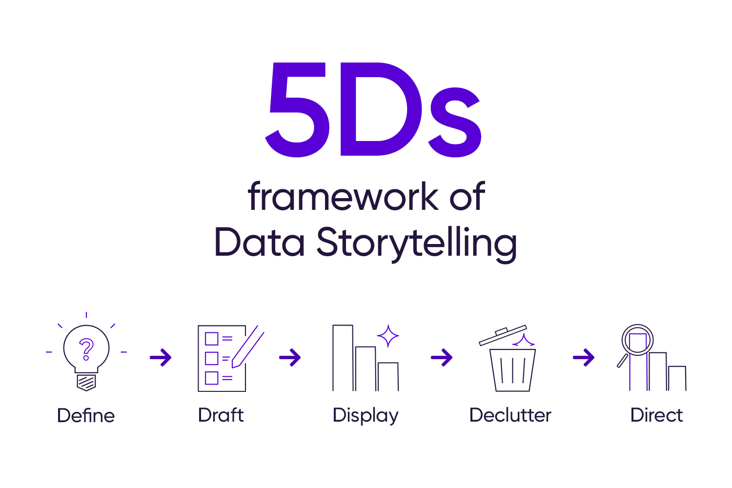
Let’s look at the different ways we can present data to an audience. This will help you choose the right approach for your next presentation, and get to “YES” when it matters.
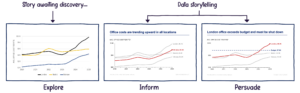
Explore
Early in the data storytelling process, we’re simply exploring the data. At this stage, you might share it casually with a colleague or your boss as you work out what the data is actually saying.
There’s no interpretation yet, and no defined key takeaway. The goal is just to surface the data, spot patterns, and start forming an initial point of view.
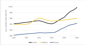
This is the kind of chart you might produce during the explore phase. Charts like this aren’t suitable for a presentation, as it forces the audience to do all of the work. Once you’re clear on the message, you’re ready to move into data storytelling.
Inform
In the inform version, a key takeaway is added to the slide title, making it easier for the audience to grasp the main message.
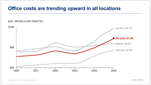
However, there is still no recommendation about what to do about the rising office costs. This is the right approach when your goal is to inform, giving your audience the facts and allowing them to draw their own conclusions.
Based on this slide alone, your audience might choose to:
- Renegotiate leases
- Transition more staff to remote work
- Relocate offices to lower-cost areas
- Do nothing
Persuade
In the persuade version, the slide goes a step further by adding a recommendation directly into the title.
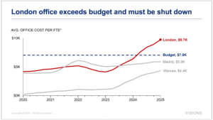
It takes a clear stance on how to address the rising costs. This is a major leap, from simply informing an audience about a trend to recommending a course of action that could impact hundreds of people!
The example here is intentionally bold, to illustrate the kind of reaction an unsolicited recommendation can trigger. The stronger or more controversial the recommendation, the more data and evidence you need to persuade your audience it is the right move.
You are not yet telling a story in the explore stage. Data storytelling begins when you move into the inform and persuade stages:
Which type of data story does your audience need?
It is critical to understand what your audience expects. Are they looking to be informed or persuaded?
Early in your career, you are usually expected to inform. As your influence grows, so does the expectation that you will be able to persuade. If you’re in doubt, ask your stakeholder directly: “Would you like me to include a recommendation?”
Want to move beyond exploring data?
If you’re ready to move beyond exploring data and start using it to inform or persuade, join one of our our scheduled workshops or contact us to set up an exclusive class for your team.