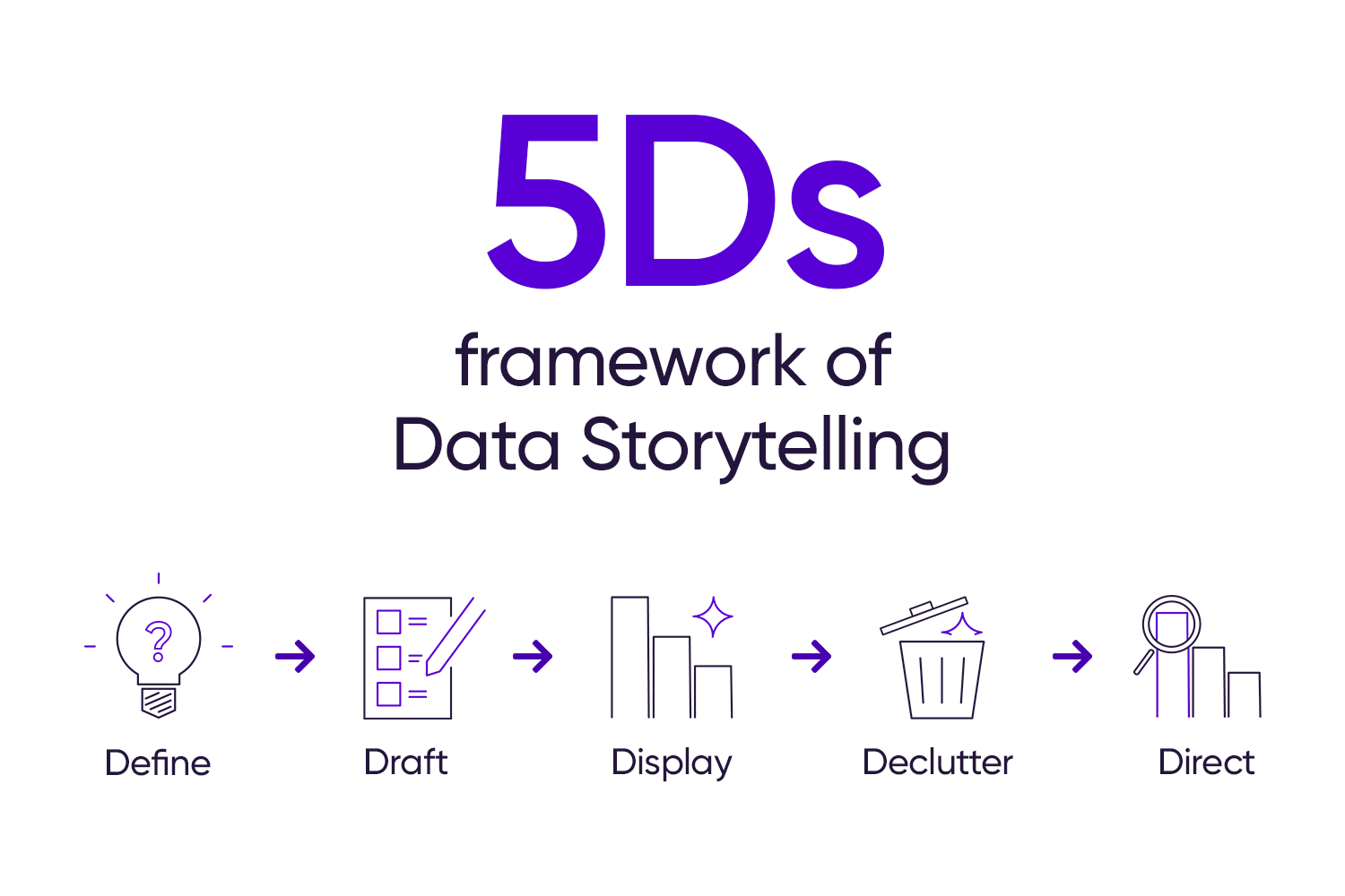
Many believe that data stories must have complex, advanced visualizations. This is a misconception. The truth is that the most effective visuals are straightforward, accessible, and simple to understand.
In this post, we’ve rounded up some practical tips for presenting data with simplicity and clarity, whatever your tool.
1. Steer clear of the “spaghetti” line chart.
Line charts are an excellent choice for visualizing trends over time. But sometimes, too much data can make the chart look like a messy plate of spaghetti, obscuring valuable trends.
For example, in the chart below, it is easy to ignore the overlapping lines at the bottom and simply focus on the top lines that are easier to read:
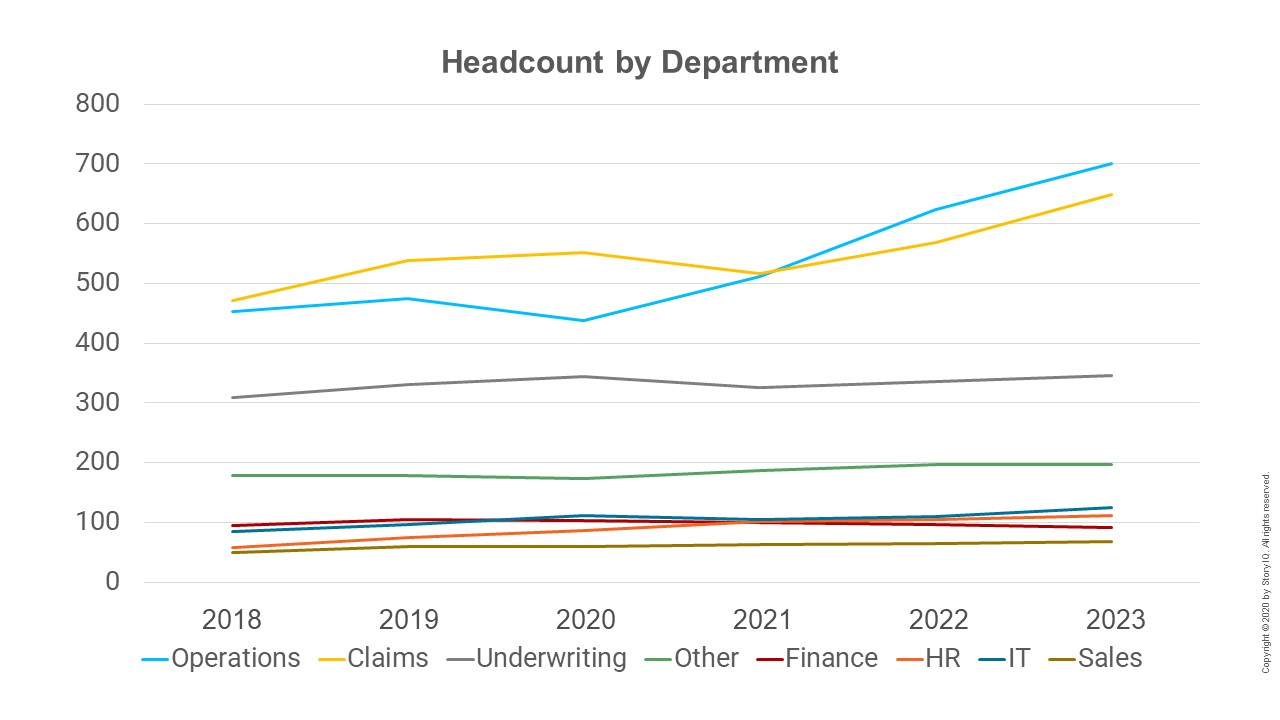
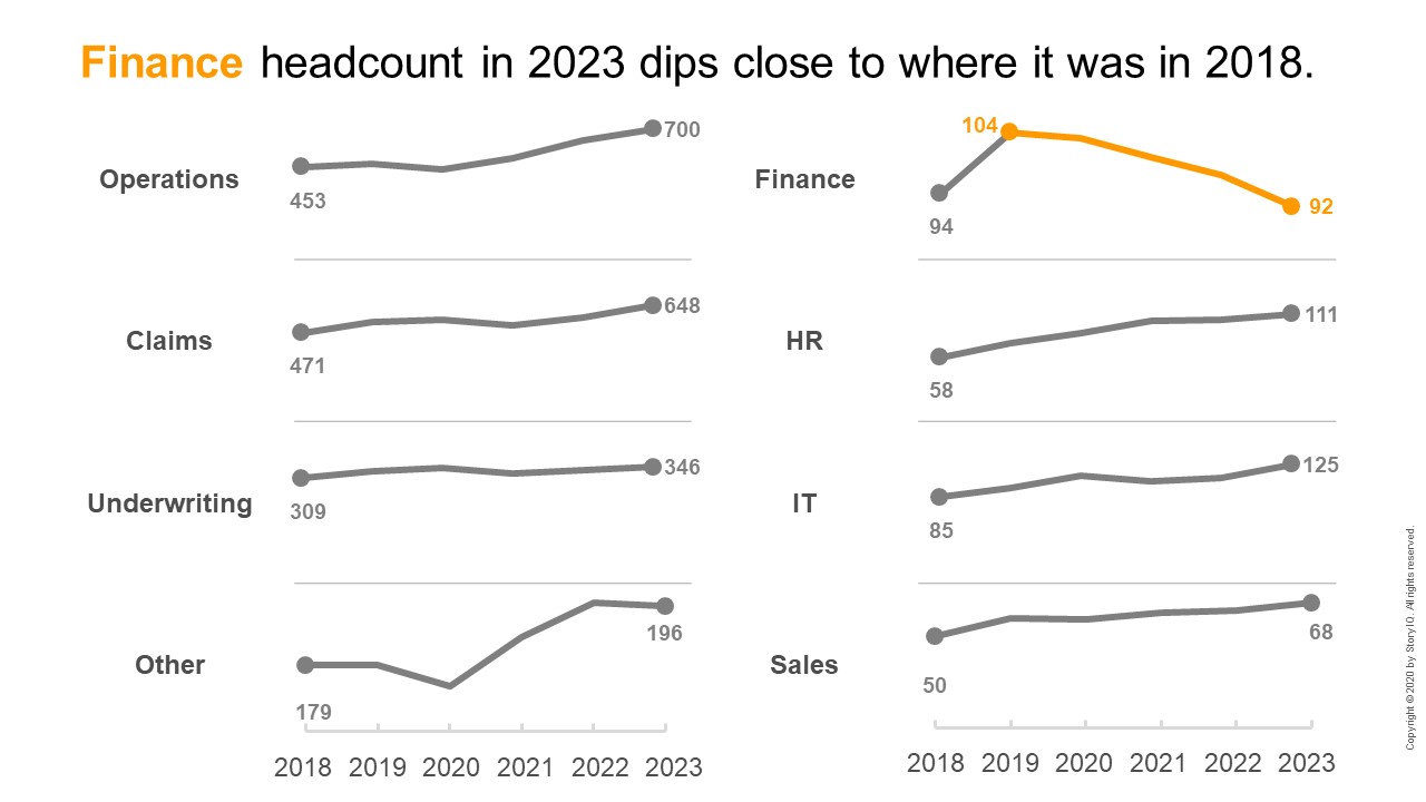
Alternatively, consider a small multiples chart to visualize the same data more clearly. Using lines to visualize the data, the small multiples version below creates a separate view of each series. The reader can now see the headcount trend per department. Now we can see the declining trend in the Finance department that was otherwise buried in the original chart.
2. Group or aggregate when it makes sense.
Another way to clean up a busy chart is to group the categories. This should provide the insights your stakeholders need.
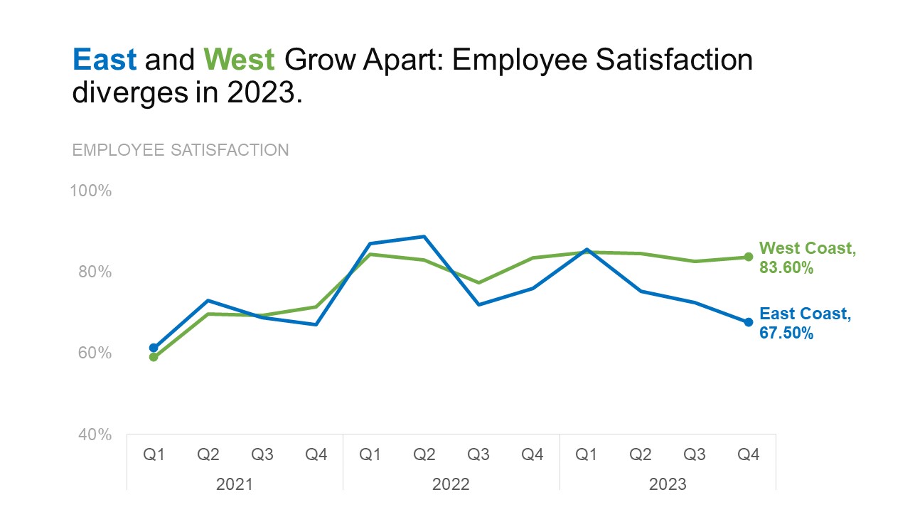
The busy line chart below makes it difficult to see the quarterly employee satisfaction data trends of the nine cities featured.
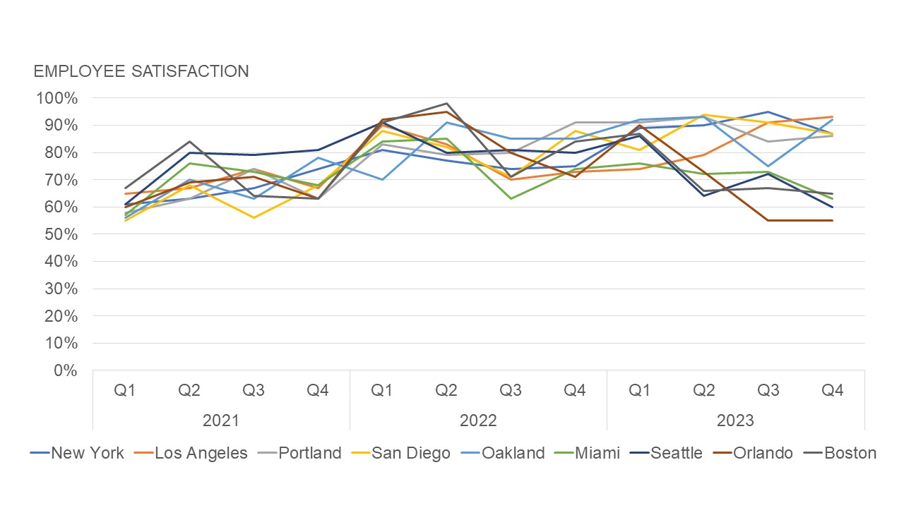
The chart below now groups nine cities into East and West Coast categories. This makes broader trends clearer. Knowing your data’s context and your audience’s needs can show if grouping or combining categories will yield better insights.
3. Spotlight the gap.
Data storytelling surfaces specific insights that guide decision-makers toward appropriate action. Sometimes, the insight isn’t in the trend created by the lines but in the distance between them.
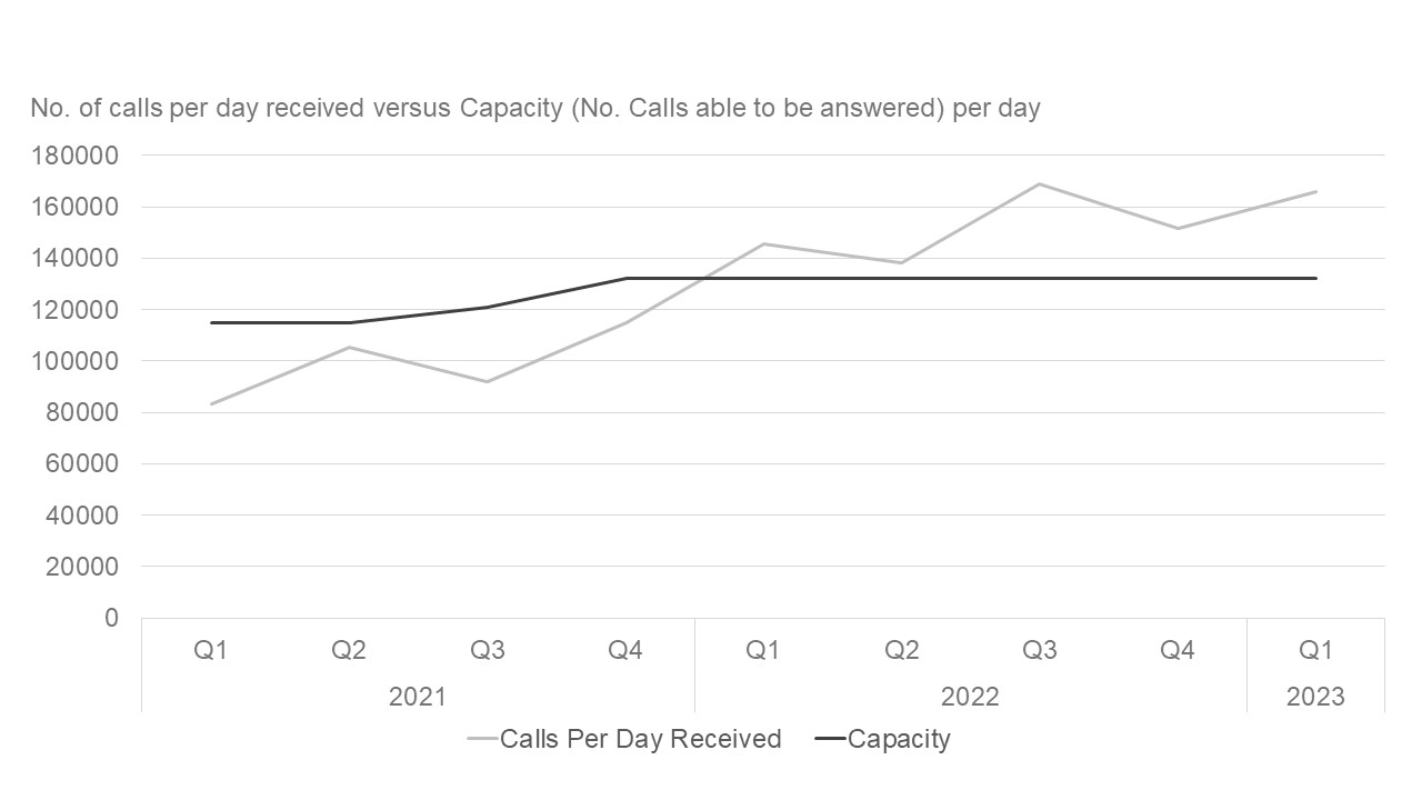
For example, the chart below shows a call center’s call capacity and the calls received per day. We can see that calls received per day have exceeded capacity since Q1 of 2022.
…but can we stress this point further?
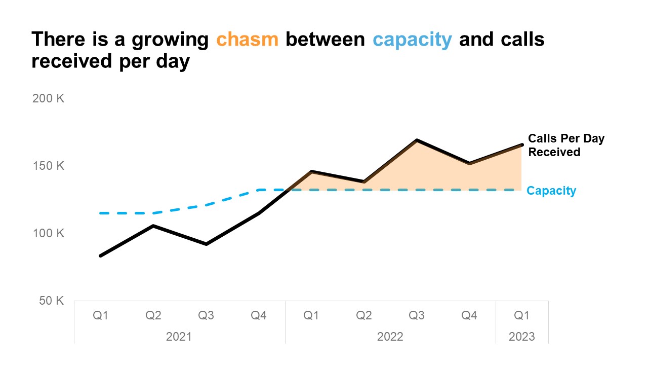
We can use visual signals, like selective color and shading, to draw the reader’s attention to the gap. This will emphasize how long this issue has been and that it is worsening. Selecting which visual elements to highlight reveals the insight at a glance.
4. Bars over donuts when comparing values.
Donut charts may look nice, but they can complicate the message. They might also weaken the main takeaway.
For example, the donut chart below features ten different data points, some of which are close to each other. The circular orientation and arced shape of the slices make it challenging to compare values accurately.
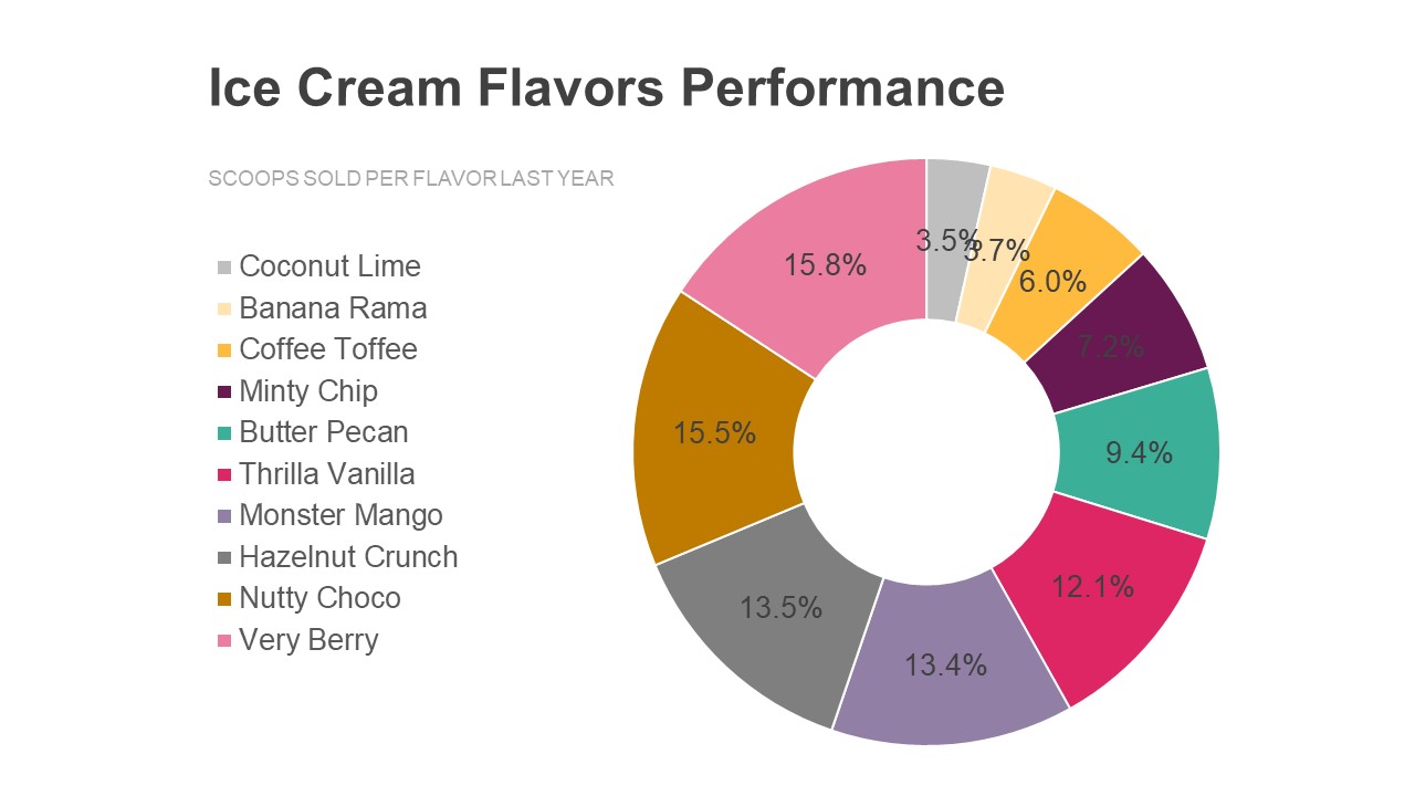
In this example, a bar chart allows for a more efficient and accurate visual comparison of the data. Lengths on a shared base are easier to compare visually. It’s also more intuitive for the reader to compare values as separate data points instead of as a part of a whole.
5. Avoid data dumps.
It can be tempting to present all the data points we have on hand to proactively address all the possible questions our audience might ask. But often, this can backfire, leading to confusion and wasted time.
The chart below shows survey results with five categories of responses across a 20-week timeframe. The stacked bar chart captures all the data but makes it hard to follow and see the trends.
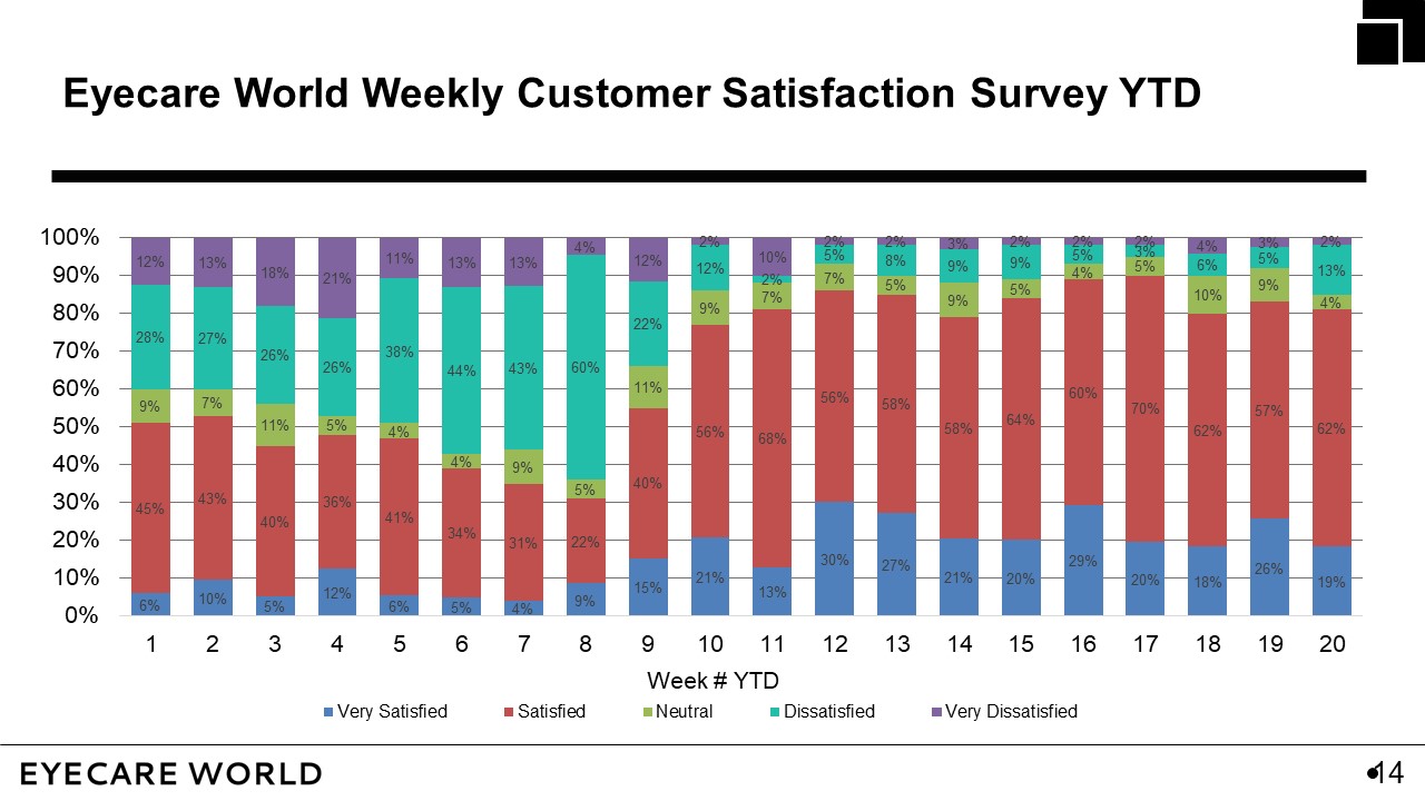
When we take the time to understand our audience and the context, we can make better decisions about what to include and leave out in our data story.
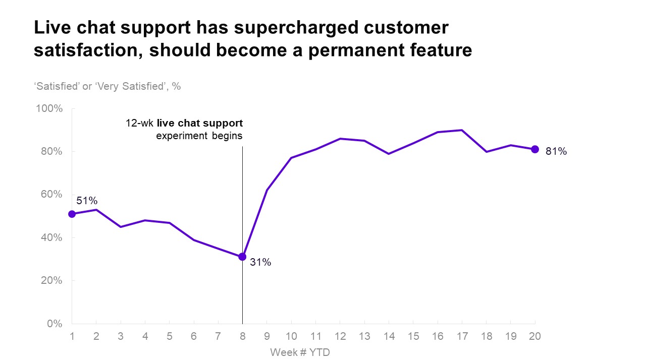
The chart below uses a line graph to show the combined “Satisfied” and “Very Satisfied” values. It also employs headlines and callouts to clarify the message, suggesting an action for the audience.
To learn more about data storytelling and other learning opportunities related to data communication, check out our scheduled workshops or contact us to set up a special class.
Learn with us and earn your certificate. See you at our next workshop!