
Most people choose a chart type based on habit or instinct. Bar chart for comparisons, pie chart for percentages, line chart for trends. But how often do you stop to ask: is this actually the easiest chart for my audience to read?
The idea of keeping visuals simple is not just common sense, it is backed by decades of cognitive research. In 1984, statisticians William Cleveland and Robert McGill published a landmark paper, Graphical Perception and Graphical Methods for Analyzing Scientific Data. Their work explores how the human brain processes different types of charts, and the takeaway is clear: simpler charts do a better job of getting the message across.
How our brains read charts
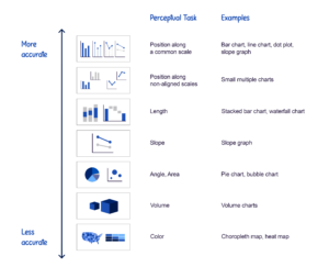
Charts communicate information through visual features like lengths, areas, colours, and symbols. Our brains interpret these features by performing little perceptual tasks such as comparing lengths, judging areas, or lining up positions.
Different chart types demand different kinds of effort. A line chart, for instance, asks the viewer to compare positions against a vertical axis. Whereas a stacked bar chart asks them to compare the lengths of different segments.
Cleveland and McGill identified a set of common perceptual tasks and then tested them with 55 participants to see which were most accurately interpreted. Accuracy here simply means how well people can estimate and compare numbers based on the way those numbers are visually represented.
The results revealed a clear hierarchy. Some tasks make it easy for viewers to make comparisons, while others invite confusion. Below, we’ve summarised their findings, along with examples of chart types that rely on each task.
The hierarchy in practice
This scale reveals which charts are the easiest for people to grasp. The higher the rank, the quicker your audience can interpret what they’re seeing.
Take an example from the lower end of Cleveland and McGill’s hierarchy: angle and area. Pie charts fall into this category because they require us to compare either the angles or the areas of the slices. Sounds simple, but in practice we’re just not great at it.
Look at the example below. Try ranking the five slices from largest to smallest and jot down your answer. Don’t be surprised if it takes a little longer than expected, this exercise shows just how much work our brains are doing behind the scenes.
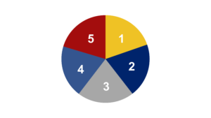
If you’re not confident in your answer, you’re not alone. Almost everyone struggles to compare the sizes of pie slices accurately. Now let’s take the exact same data and look at it in a different way: a bar chart with a flat baseline.
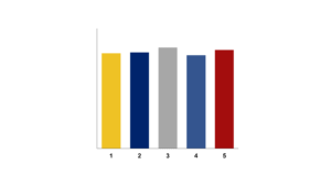
This version instantly feels easier to interpret. You can probably rank these bars from largest to smallest with confidence.
The difference comes down to the type of mental work each chart demands. The pie chart forces us to compare angles and areas, a task that’s difficult and often inaccurate. The bar chart, on the other hand, just asks us to look at the position of the tip of each bar. In a split second, it’s clear that the light blue bar is tallest.
Cleveland and McGill called this perceptual task “positions along a common scale”, because we are comparing each bar’s tip against a single vertical axis. As their research shows, this is the easiest task for people to perform accurately, making the bar chart a much better choice for this dataset.
What this means for you
Of course, this doesn’t mean you need to limit yourself to the charts that rank highest on Cleveland and McGill’s hierarchy. If you do, your data story will be nothing but line charts, bar charts, and dot plots.
Instead, the value of the hierarchy lies in helping you recognise the strengths and weaknesses of different visuals. With this understanding, you can make deliberate, user-friendly choices that keep your audience focused on your message rather than wrestling with your charts.
The next time you reach for a pie chart, ask yourself: is there a simpler perceptual task I could be asking of my audience? The answer might just change the chart you choose.
Get help choosing visuals with The Display Decider
Selecting the right chart from the countless options available can feel overwhelming. This is why we created The Display Decider, a quick-reference guide designed to help you choose the best chart for almost any situation.
Where possible, The Display Decider builds on the research of Cleveland and McGill by recommending chart types that perform well on a perceptual basis, making it simpler for you to select visuals that reduce cognitive effort and keep the focus on your message.
Think of The Display Decider as a helpful guide, not a strict rulebook. Data visualization is equal parts art and science, and there is rarely one perfect way to present information in every context. Instead, this tool gives you a strong starting point so you can make thoughtful, confident choices about how to present your data effectively.
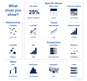
Sometimes a single visual must do more than one job. For example, showing a trend while also highlighting specific values, or combining a comparison with a trend. When this happens, The Display Decider can still guide you. Focus on the single most important feature you want to highlight and use this to steer your choice of chart.
You may also notice that some of the most popular charts, such as pie charts and donut charts, are missing from The Display Decider. This omission is intentional. While you are free to experiment with them, we have yet to see a case where a data story is not told more clearly with one of the core visuals included here.
Want to build charts your audience can actually read?
If you’re ready to start choosing visuals that make your data clearer and easier to act on, join one of our our scheduled workshops or contact us to set up an exclusive class for your team.