What makes an impactful data visual? When we inform our chart creation with the science of visual perception and cohesive storytelling, we land on a compelling visual that can engage our audience with the data.
We have gathered a running list of real data visualization examples that can inspire us to see familiar charts in a fresh light and show that clarity and creativity can co-exist.
1. A choropleth map and bubble chart combined showing the density of bookings along the solar eclipse path

Source: Airbnb eclipse bookings illustrate path of totality. Axios. https://www.axios.com/2024/04/05/airbnb-bookings-eclipse-april-8-map
2. A simple bar chart visualizing the drastic comparison of student absenteeism across time-based data

Source: Why School Absences Have ‘Exploded’ Almost Everywhere. The NY Times. https://www.nytimes.com/interactive/2024/03/29/us/chronic-absences.html
3. An area chart showing the story of the music industry’s resurgence thanks to streaming

Source: Chartr. (Original data source: https://www.riaa.com/u-s-sales-database/)
4. Area charts used to visualize the massive decline of live birth rates and fertility rates globally

A Small Multiple version featuring data per country for comparison
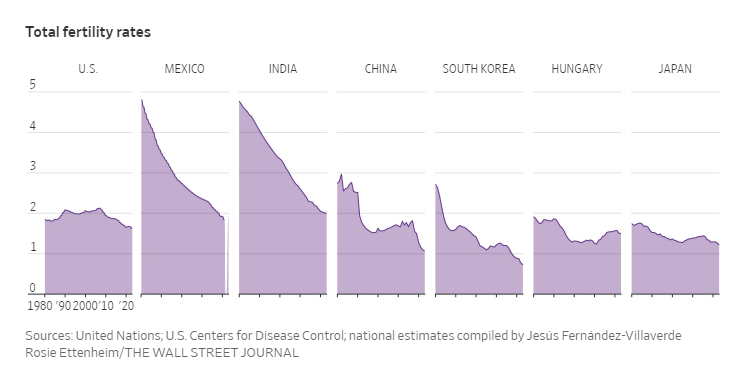
Source: Wall Street Journal. https://www.wsj.com/world/birthrates-global-decline-cause-ddaf8be2?mod=world_trendingnow_article_pos1 [Image with a headline from WSJ Instagram page]
Data Source: UN, US Centers for Disease Control
5. A stacked bar chart showing the aggregate protein diet across regions

Source: You’re probably eating way too much protein. Vox. https://www.vox.com/future-perfect/24049505/protein-intake-fiber-plant-based-vegetarian-vegan-meat
6. A bubble chart visualizing the relation between wealth and happiness across different regions and populations

Source: Global Look at Wealth and Happiness, Visual Capitalist. https://www.visualcapitalist.com/wp-content/uploads/2022/09/wealth-and-happiness-full-size.html
7. Spotlighted metrics to show a snapshot of inflation

Source: Philippine Statistics Authority: Inflation Report. https://www.facebook.com/PSAgovph/posts/pfbid0FhxR5QXc3F2mZfhJvN6a8mrZCNDzQ6qpDcbnXZsqbLd7ExLFm8cTvBsoZLj9BABdl
8. A small multiples area chart showing the comparison across search results

Source: How Crocs became a clog-selling profit machine, Sherwood News. https://sherwood.news/business/crocodilia-how-crocs-became-a-clog-selling-profit-machine/
9. A waffle chart showing the general ratio between two categories

Source: Exploring “The Simpsons” with DataWrapper for the 30DayChartChallenge 2024. https://www.cedricscherer.com/2024/04/01/contributions-30daychartchallenge-2024/
10. A scatter plot pointing out the outliers in the data s

Source: Exploring “The Simpsons” with DataWrapper for the 30DayChartChallenge 2024. https://www.cedricscherer.com/2024/04/01/contributions-30daychartchallenge-2024/
To learn more about data storytelling and other learning opportunities related to data communication, check out our scheduled workshops or contact us to set up a special class.
Learn with us and earn your certificate. See you at our next workshop!