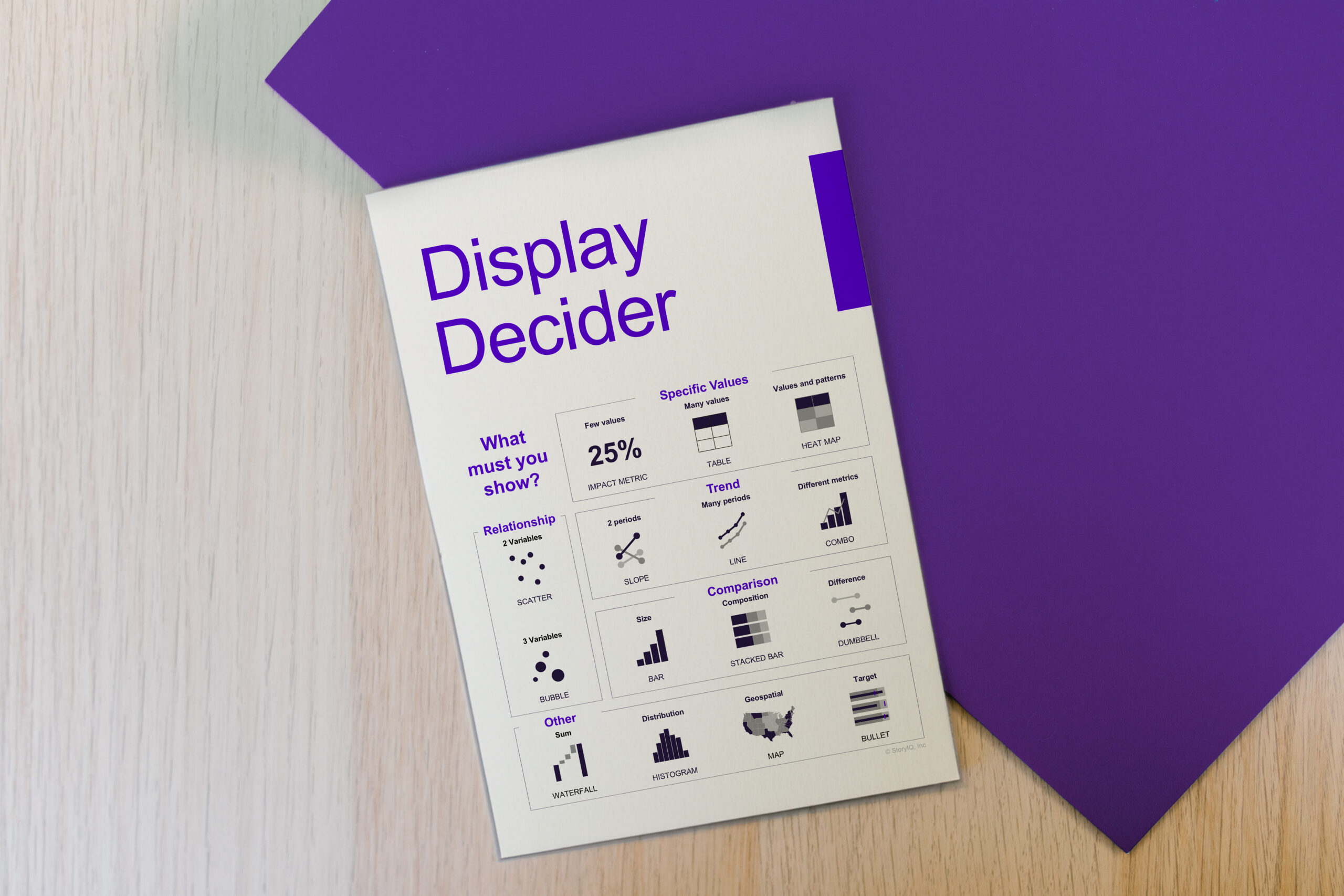

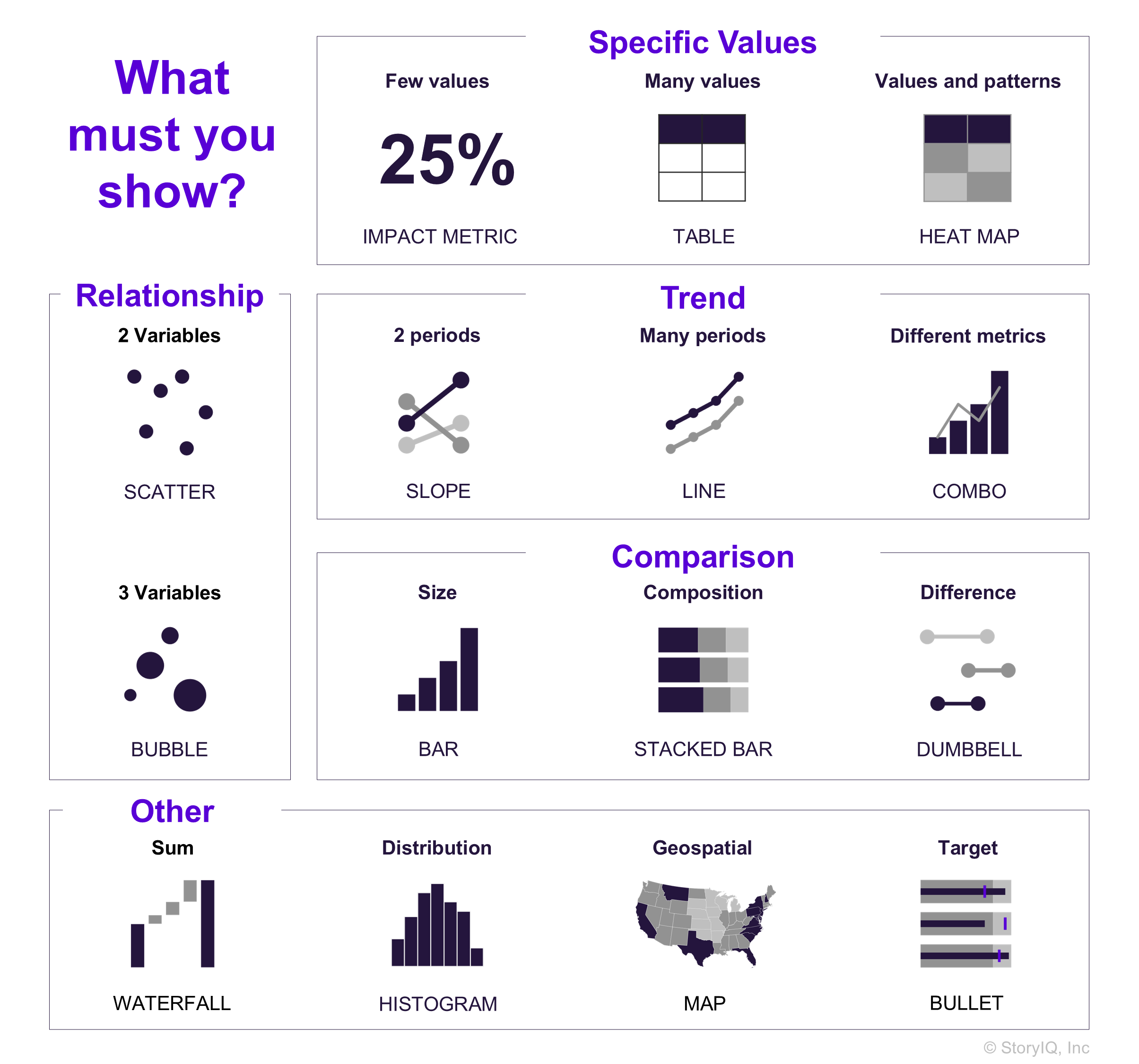
There is no easy answer. We acknowledge that visualizing data is a creative process – there isn’t a single ‘correct’ chart that is the only solution for a specific set of data. And this can make chart selection daunting for data storytelling beginners. We’ve put together our ‘Display Decider’ as a thought starter for making chart selection easier. Disagree? Put your commentary on our LinkedIn post here .
To learn more about data storytelling and other learning opportunities related to data communication, check out our scheduled workshops or contact us to set up a special class.
Learn with us and earn your certificate. See you at our next workshop!