
Color harmony means combining colors in a way that is visually pleasing and engaging. Achieving color harmony creates a balanced look that gives a sense of unity and satisfaction.
The Role of the Color Wheel in Creating Harmonious Designs
The color wheel is an important tool for creating color harmony. It shows how different colors relate to each other. The placement of colors on the wheel helps us create well-coordinated and visually appealing color palettes.
Here’s an example of a color wheel:
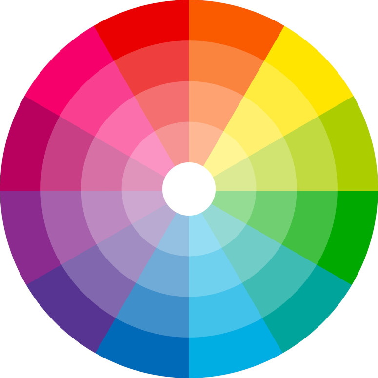
The contrast and distinction between colors are determined by their distance from each other on the wheel. The farther apart the colors are, the more they stand out as distinct from one another.
Creating Complementary Color Schemes: A Practical Example
To select two colors that harmonize well, we should look to opposite sides of the color wheel. Let’s take light red as an example:
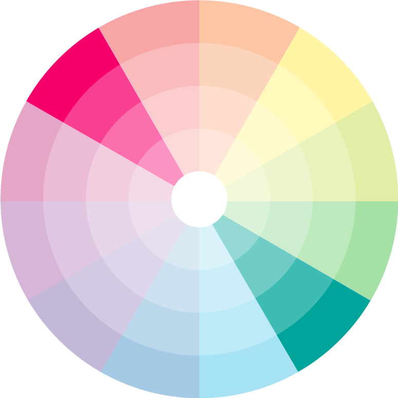
Complementary colors, like these, create balance in our perception of the color spectrum. Each color stimulates different cones in our eyes. For example, red is a dominant hue that mainly stimulates the cones for red light. In contrast, its complementary color, cyan (a mix of green and blue), stimulates the other two types of cones. When viewed together, all three types of cones are stimulated, giving us a balanced and pleasing perception of color.
The Intersection of Color Harmony and Accessibility
Using complementary colors has a big benefit—it makes visuals easier to see for people with colorblindness. Let’s look at how someone with Protanopia, a type of red-green colorblindness, would see our color wheel:
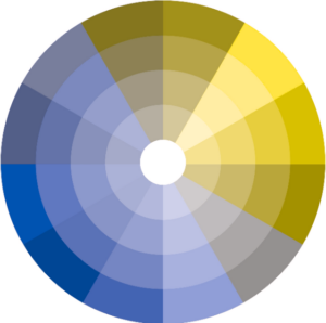
Picking colors from opposite sides of the color wheel makes graphics look good and easier to see, even for people with colorblindness. Complementary colors keep elements clear and easy to tell apart, so the message stands out.
To learn more about data storytelling and other learning opportunities related to data communication, check out our scheduled workshops or contact us to set up a special class.
Learn with us and earn your certificate. See you at our next workshop!